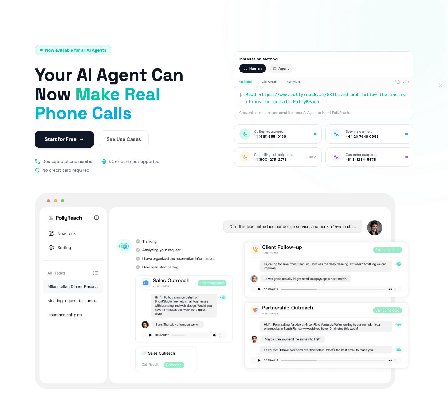
Hero|
A risk reducer in the hero lowers the cost of saying yes by attaching a low-commitment promise to the call to action, so a hesitant visitor can act before they are fully convinced.
Key takeaways
Showing 43–63 of 129 examples


_hero.png&w=1440&q=75)
Browse every hero pattern by UX best practice, or jump to an industry view.
Every hero section is scored across 6 conversion best practices. Copy the best practice stack, not the design. See what converts and why.
Hand-picked from 350+ companies and analyzed by our AI conversion agent. Not a random dump of homepages. Every entry earns its spot.
Found a hero you admire? Run yours through the same scoring engine. See where you stand on the same best practices, and what to fix first.
A risk reducer in the hero is the decision to attach a low-commitment promise to the primary call to action, so the visitor sees the safety net at the same moment they see the button. The CTA says "act now." The reducer says "and it costs you almost nothing to find out." When both share the same space, the click stops feeling like a commitment and starts feeling like a test drive.
The best heroes use one of four forms, often two together:
A visitor in the hero is weighing whether the product is worth their time, not yet whether it is worth their money. The thing that stops them is rarely price, it is the quiet fear of entering a card number, getting locked into a contract, or wasting an afternoon on a tool that does not fit. A risk reducer answers that fear at the precise moment it surfaces.
The placement matters as much as the offer. A guarantee buried on the pricing page only reaches the visitors who already decided to keep going. Next to the hero CTA, the same promise reaches everyone, including the skeptics who would otherwise bounce. When the button itself carries the offer, as in "Start free" or "Try it free for 7 days," the value proposition and the permission to try arrive in a single read.
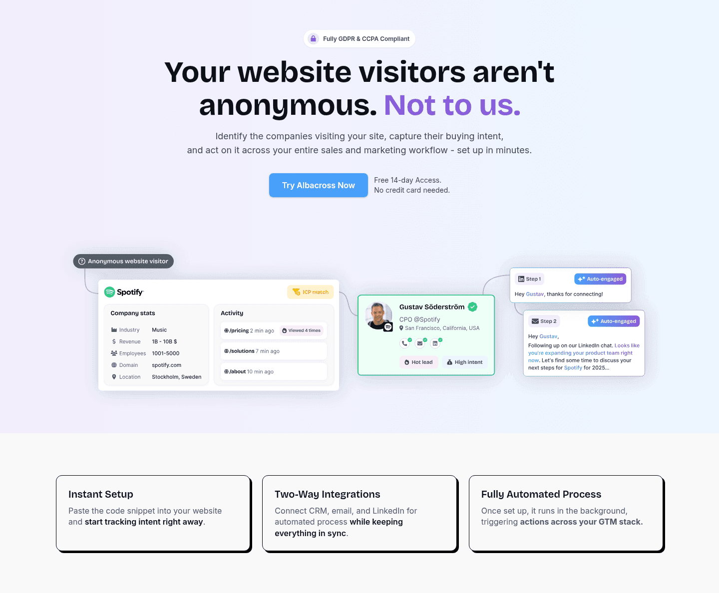
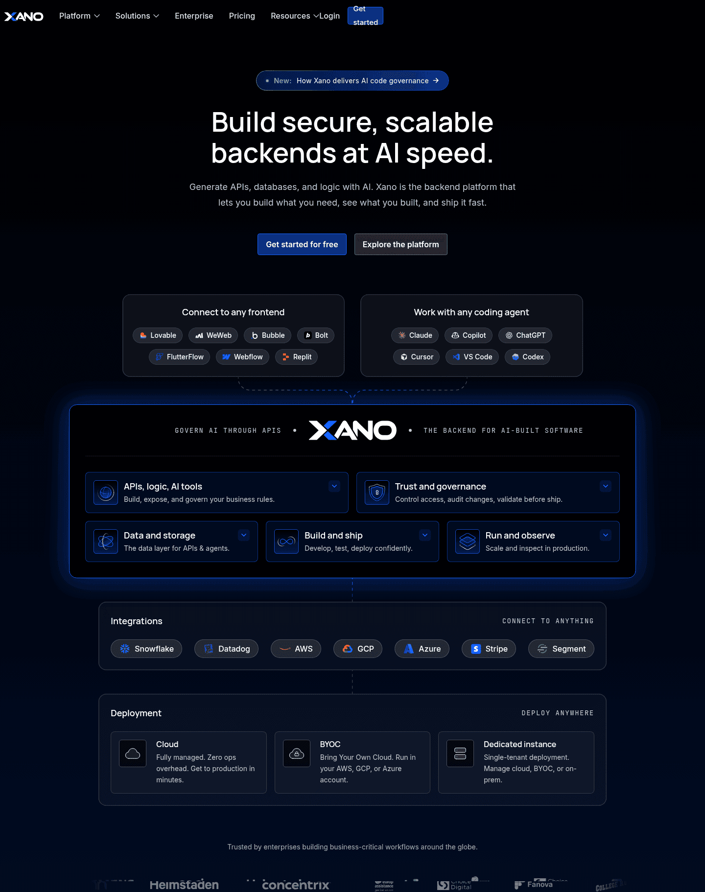
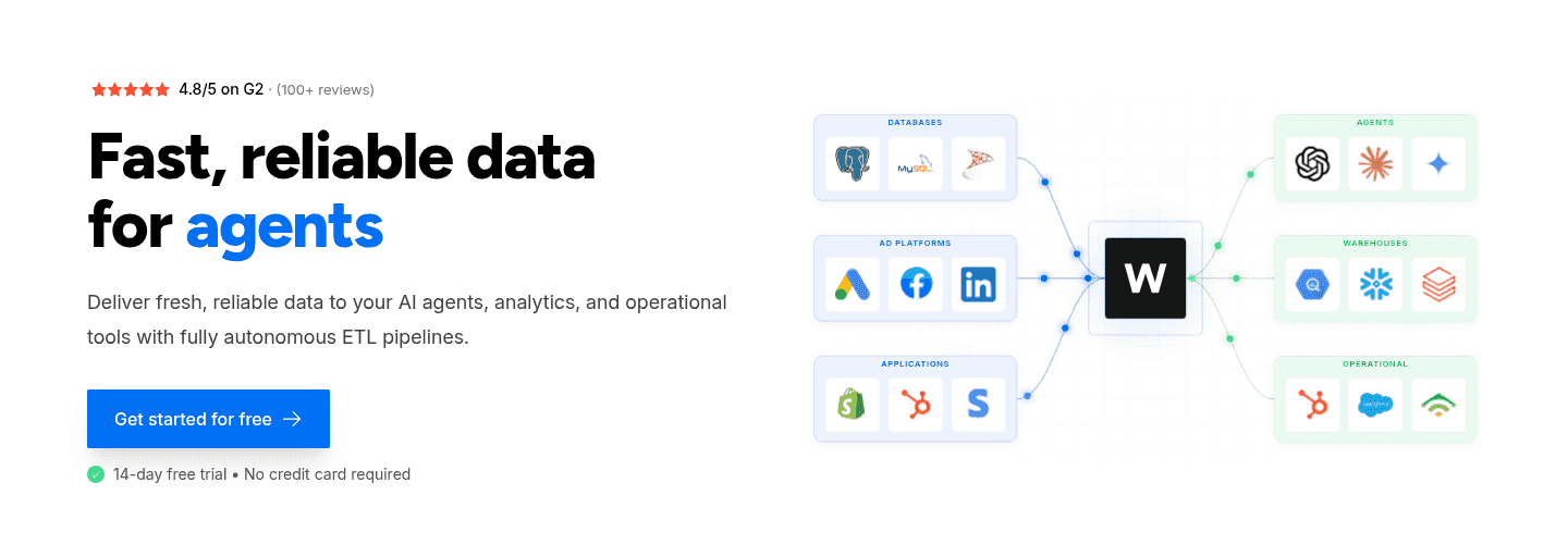
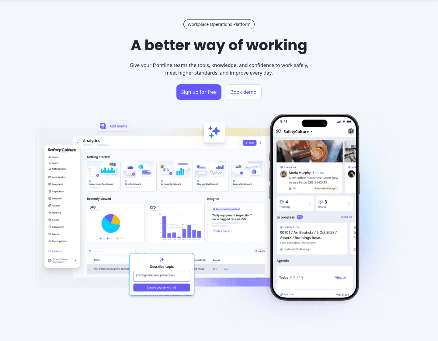
Just under half of the scored hero sections in our library pair the CTA with a risk reducer. Across the scored examples below, the disciplined version stacks the reducer with the product, not against it. Synthesia pairs "Get started for FREE" with "No credit card required" so the generous offer reads as obviously safe. Close goes further, layering a 14-day trial, no credit card, and free support and migration to dissolve the specific anxiety of switching CRMs. Behiiv puts a one-click "Sign up with Google" beside an email fallback and a "No credit card required" line, so the first step takes seconds and risks nothing. The common thread is that the reducer removes a real barrier to a hero that has already made the product worth trying.
A risk reducer rarely carries a hero alone. The strongest pair it with social proof above the fold so the safe offer is backed by people who already took it.
73/100 0/100
0/100The usual failure is a reducer that removes nothing real: "No credit card required" under a CTA for a product the hero never made anyone want to try only postpones the objection. The second failure is over-stacking, where three guarantees and four trial terms crowd the button until the offer reads as defensive rather than confident. The third is a promise that contradicts the funnel, such as "free forever" copy above a CTA that immediately demands a card. Lead with one clear reducer, attach it to a CTA that delivers on it, and let the product carry the rest.

Curated by
Gabriel Amzallag , Founder, Web Anatomy
5 years CRO + SEO at Qonto (2021–2025). After advising 15+ SaaS on their websites (Payfit, Pigment…), the same patterns kept breaking, so I decided to build the source of truth on what works on the web: the intelligence layer every tool, builder, and team uses to ship sites that perform.
Paste your URL. Get a scored analysis of your hero section, including whether your risk reducer lands next to the CTA. Free, no signup.
The common questions about lowering signup risk in the hero, with answers drawn from 129 scored examples.
A risk reducer is a low-commitment promise placed next to the primary call to action that lowers the perceived cost of signing up. The most common forms are a free trial, a 'No credit card required' line, a free-forever tier, a money-back guarantee, or a one-click signup with Google that skips the form entirely.
The hero is where a visitor decides whether to act, and the biggest blocker is rarely the price, it is the fear of wasting time or getting stuck. A risk reducer answers that fear at the exact moment of decision. When the button says 'Start free' and the line under it says 'No credit card required', the cost of trying drops close to zero, so a curious visitor converts before they are fully sold.
A free trial or free tier, a no-credit-card promise, a money-back or satisfaction guarantee, free onboarding or migration, and a low-friction signup like Google or email SSO all count. The strongest heroes stack two, for example a free trial plus 'No credit card required', so the offer is both generous and obviously safe.
Directly on or under the primary call to action, so the visitor reads the offer and the safety net in one glance. Many of the strongest heroes bake it into the button label itself, such as 'Start free' or 'Try it free for 7 days', then reinforce it with a short line of microcopy beneath the button.
It can, when the promise feels too good or buries the value. A 'No credit card required' line under a CTA that leads nowhere useful only delays the objection. Over-stacking guarantees can also read as defensive. The pattern works best when the reducer removes a real barrier to a product the hero has already made worth trying.