New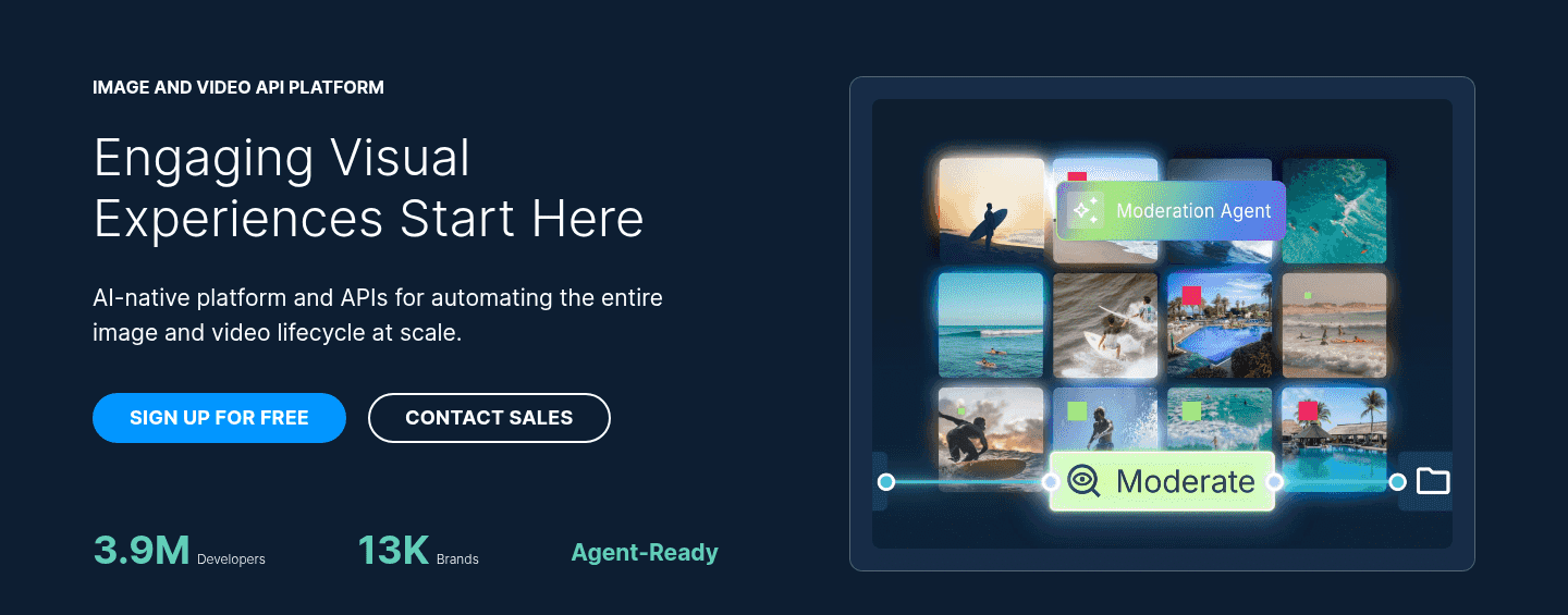
Hero|
A product visual in the hero answers what the product is and what using it feels like faster than any sentence, by showing the real interface instead of an abstract graphic.
Key takeaways
Showing 106–126 of 196 examples


Browse every hero pattern by UX best practice, or jump to an industry view.
Every hero section is scored across 6 conversion best practices. Copy the best practice stack, not the design. See what converts and why.
Hand-picked from 350+ companies and analyzed by our AI conversion agent. Not a random dump of homepages. Every entry earns its spot.
Found a hero you admire? Run yours through the same scoring engine. See where you stand on the same best practices, and what to fix first.
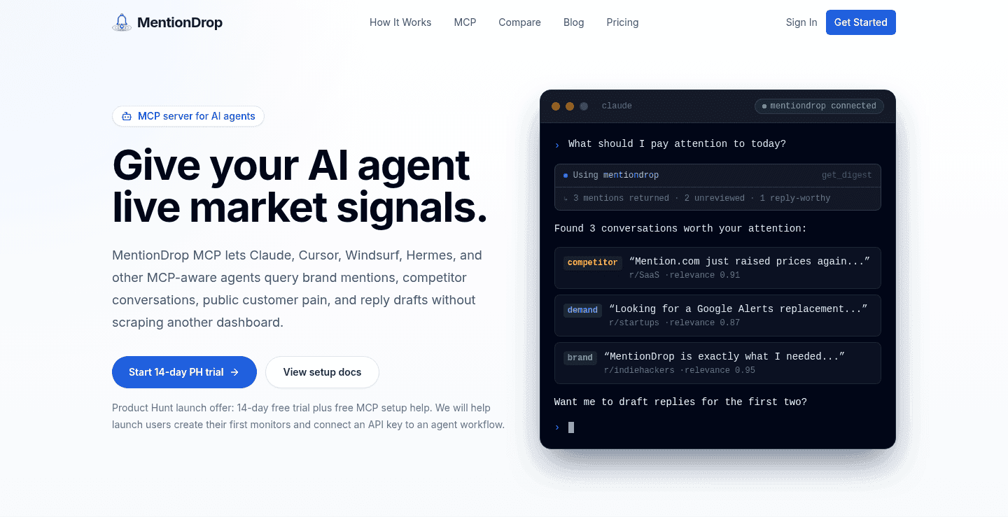
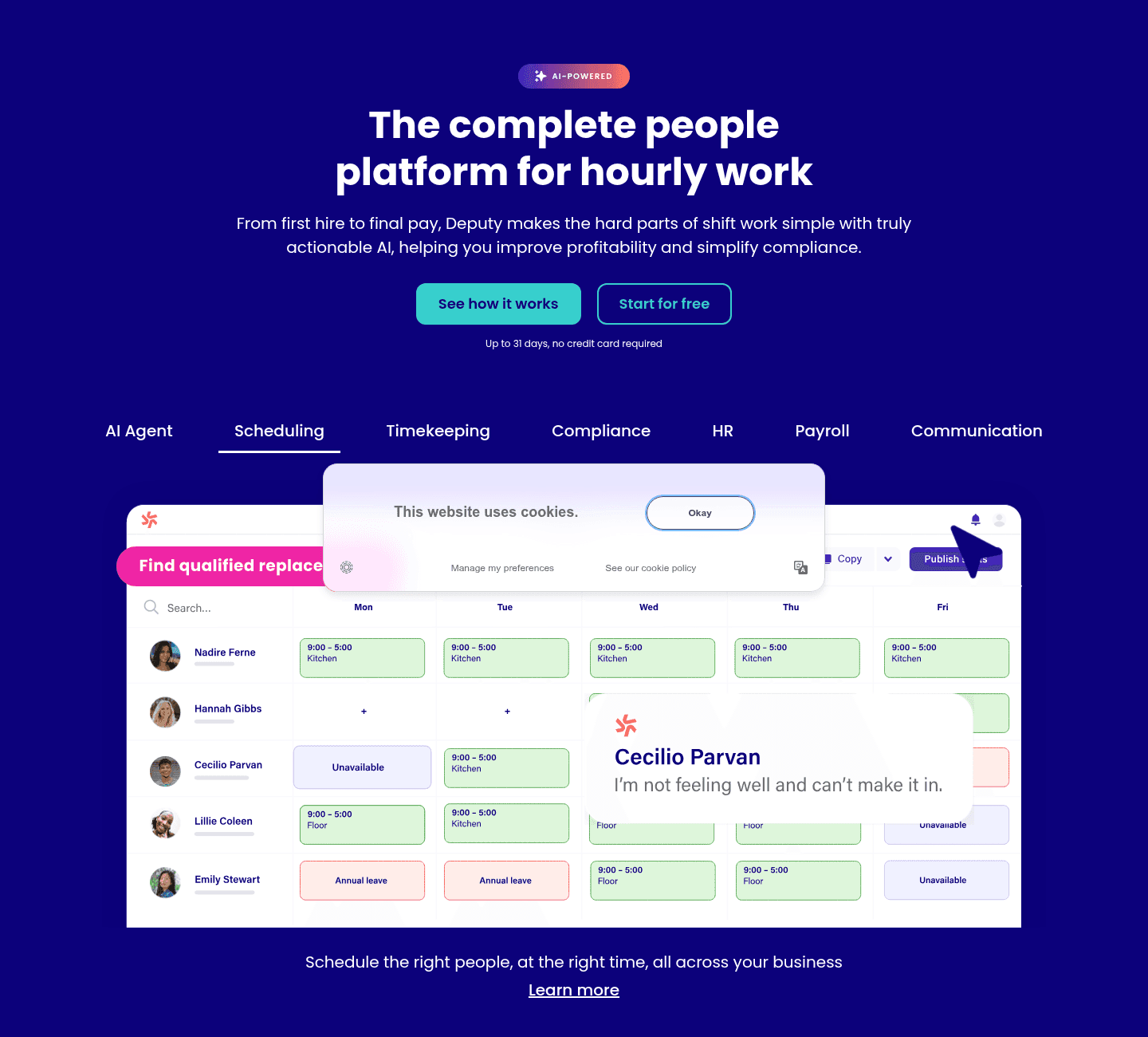
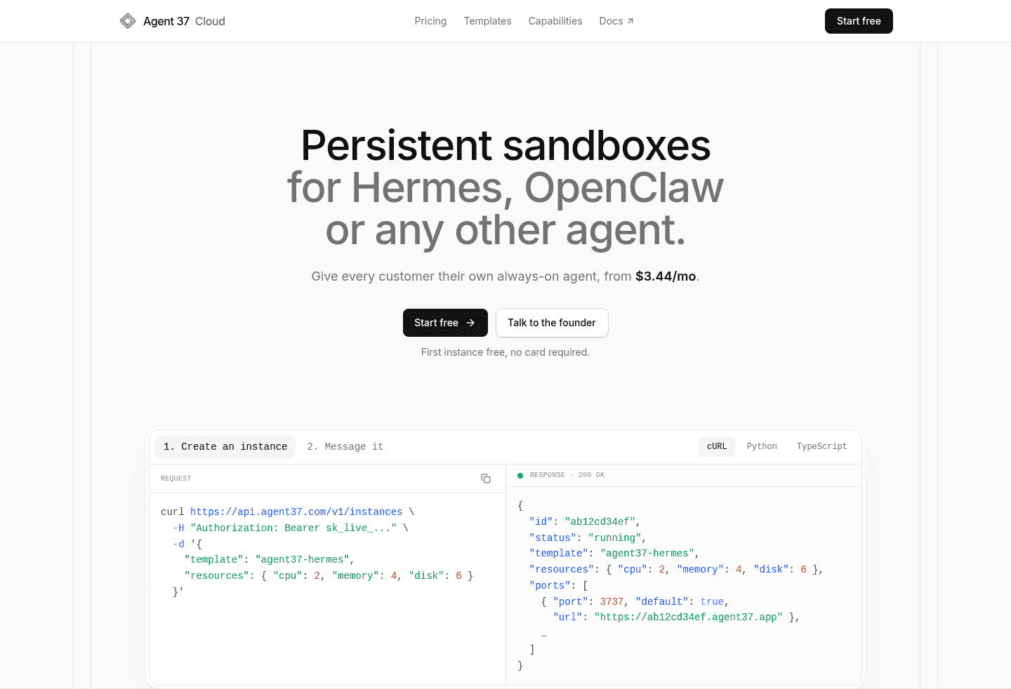
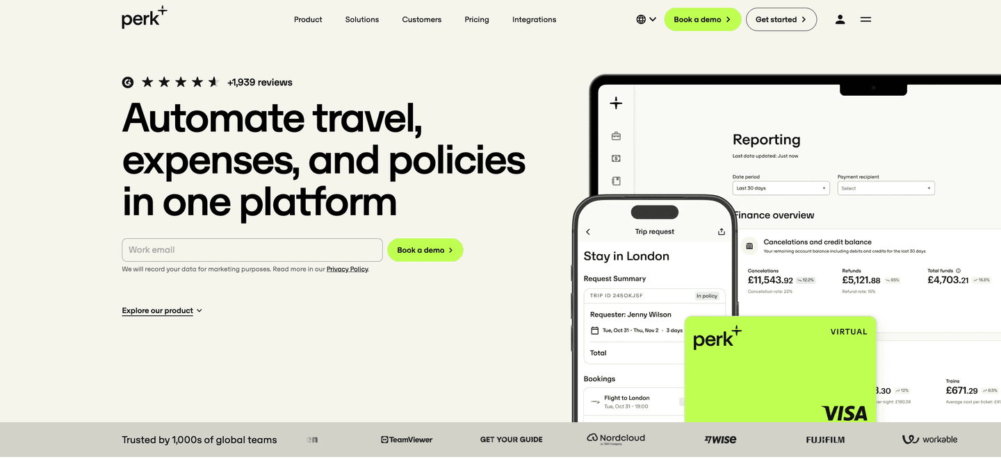
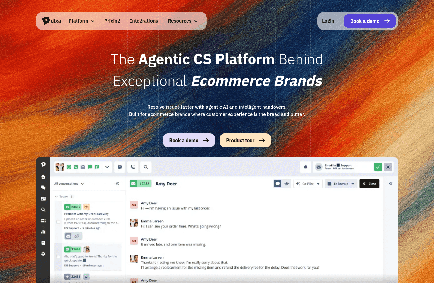
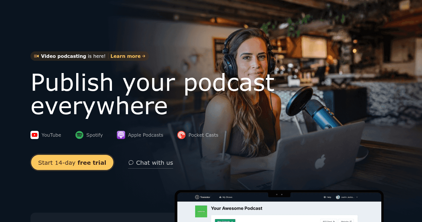
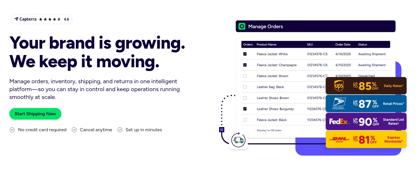
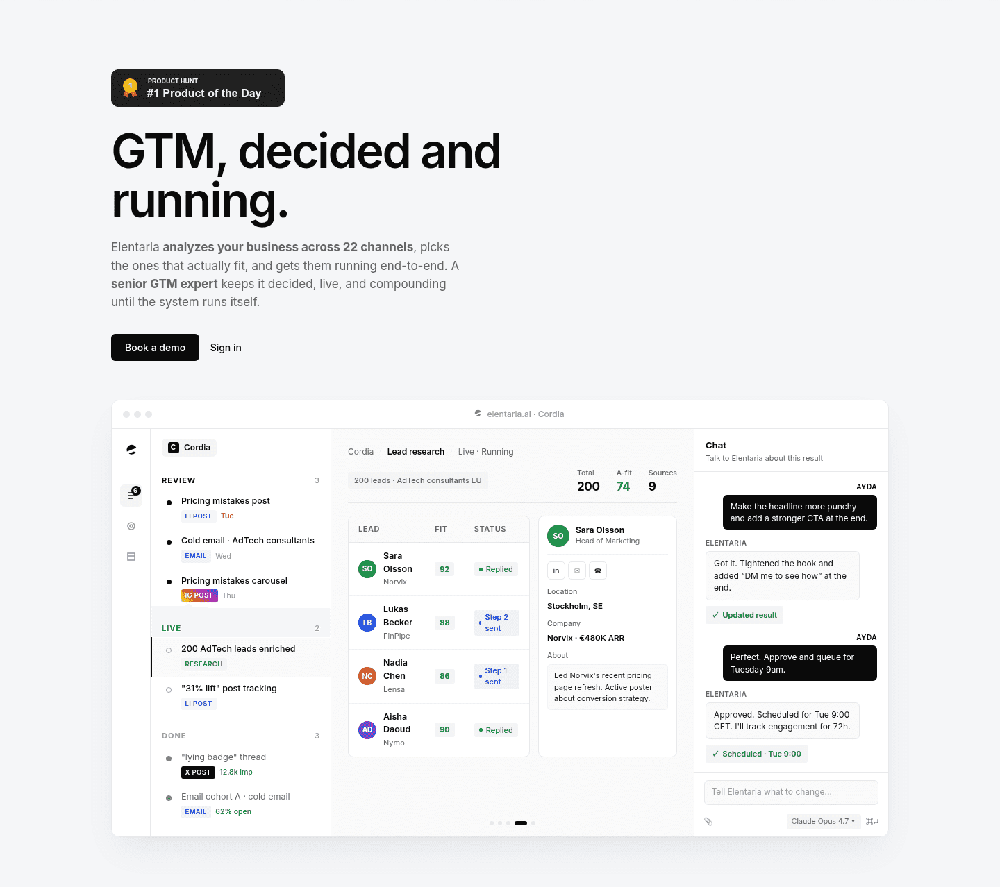
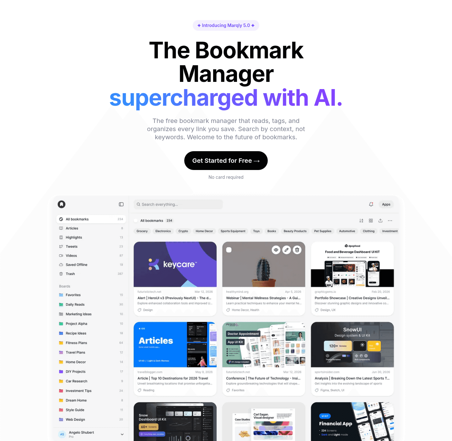
A product visual in the hero is the decision to show, not tell. Instead of an illustration that could front any company, the hero carries the real thing: a screenshot, a focused feature view, or a short demo. It lets the visitor see the product and start judging fit before the copy has said a word.
The strongest heroes are deliberate about what they show:
Seeing is faster than reading. A real interface communicates category, polish, and the feel of the experience in a single glance, which is exactly the judgment a visitor is trying to make in the hero. Showing the product also signals confidence. Pages that hide the product behind abstract art often do so because the product is not ready, and visitors read that hesitation.
About two-thirds of the scored hero sections in our library show a real product visual. Across the scored examples below, the pattern that performs is a clean, legible product visual cropped to the moment of value, placed so it shares the hero with the headline and CTA rather than crowding them out. The best pages resist the urge to show everything. They show the one screen that makes the value obvious.
Showing the product earns attention. Pair the visual with social proof above the fold so the interface is backed by other people's trust.
64/100 0/100
0/100The usual failures are a full dashboard shrunk until nothing is readable, a "product" image that is actually a stock illustration in disguise, and a visual so busy it competes with the headline. Show one legible, real view of the product, crop to what matters, and let it support the message instead of burying it.

Curated by
Gabriel Amzallag , Founder, Web Anatomy
5 years CRO + SEO at Qonto (2021–2025). After advising 15+ SaaS on their websites (Payfit, Pigment…), the same patterns kept breaking, so I decided to build the source of truth on what works on the web: the intelligence layer every tool, builder, and team uses to ship sites that perform.
Paste your URL. Get a scored analysis of your hero section, including whether it shows the real product above the fold. Free, no signup.
The common questions about showing your product in the hero, with answers drawn from 196 scored examples.
It means the hero image is the real product: a screenshot of the app, a focused view of one feature, or a short looping demo. It is the opposite of a generic illustration, a stock photo, or an abstract 3D graphic that could belong to any company.
A visitor decides whether your product fits faster by seeing it than by reading about it. A real interface communicates category, polish, and what the experience feels like in one glance. It also signals confidence: companies that hide the product usually have a reason, and visitors sense it.
A clean, legible view of the part of the product that delivers the core value, not a cluttered full dashboard shrunk to fit. Many of the strongest heroes crop to one screen or one feature, annotate the key moment, or use a short auto-playing clip that shows the product in motion without demanding a click.
When the product is visually unremarkable or pre-launch, or when the value is an outcome rather than an interface. In those cases a result visualization, a diagram of the mechanism, or a strong proof element can carry the hero better than a plain screenshot.