Footer|
A secondary call to action in the footer gives visitors who reached the bottom without converting one more clear next step, instead of a dead end of links and legal text.
Key takeaways
Showing 85–96 of 96 examples
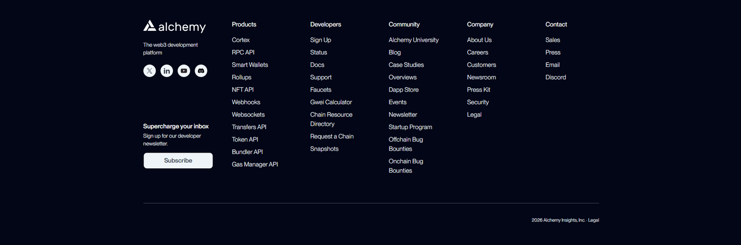
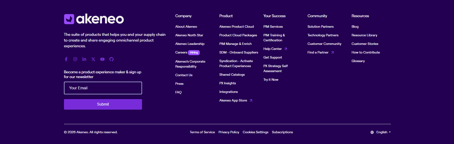
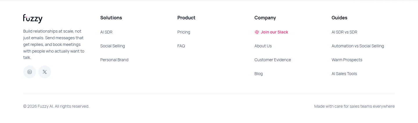
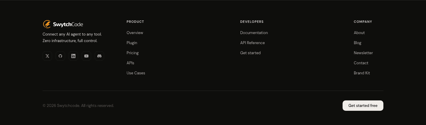
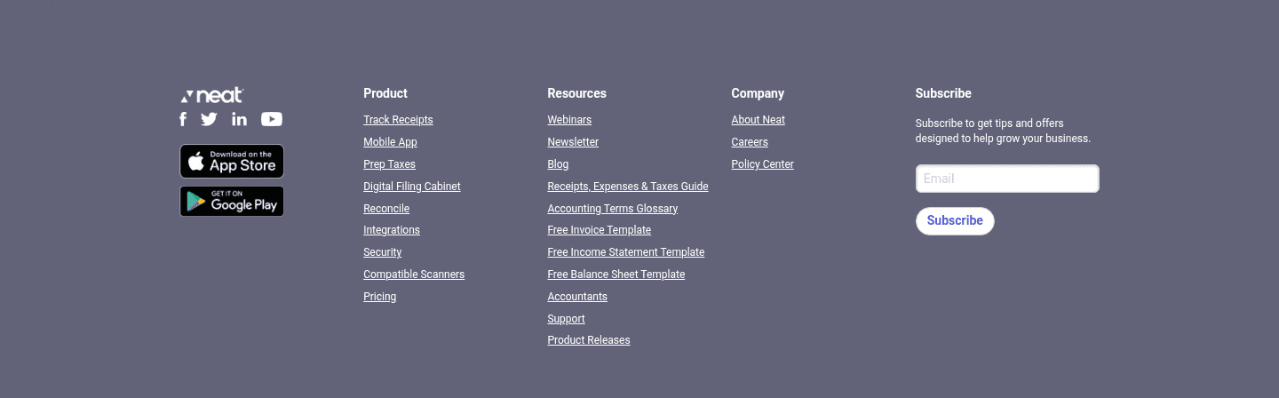


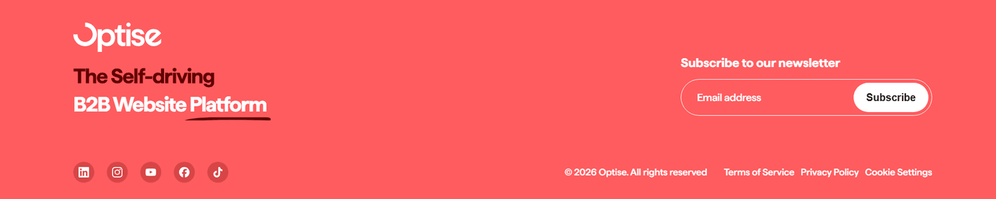

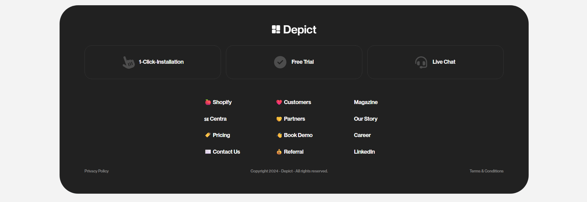
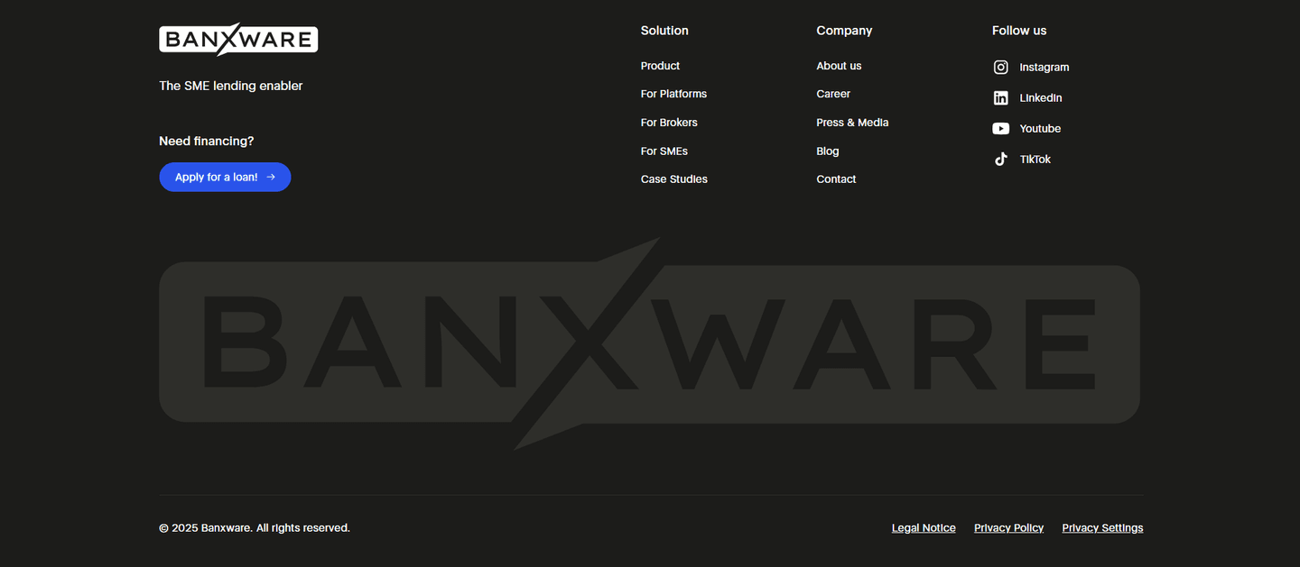
Every footer is scored across 5 conversion best practices. Copy the best practice stack, not the design. See what converts and why.
Hand-picked from 650+ companies and analyzed by our AI conversion agent. Not a random dump of footers. Every entry earns its spot.
Found a footer you admire? Run yours through the same scoring engine. See where you stand on the same best practices, and what to fix first.
The footer is the strip at the very bottom of the page, the block a visitor lands on after reading everything else. A secondary conversion footer treats that strip as a last chance to act rather than a graveyard of links. The primary call to action higher up asks for the main commitment: start a trial, book a demo, buy. A footer secondary CTA is the offer for the visitor who reached the bottom without saying yes to that, and it gives them a smaller or different way forward instead of a dead end.
The best footers use one of four forms, sometimes more than one together:
A visitor who scrolled all the way to the footer gave the page their full attention and still did not convert. That is rarely disinterest. More often the main offer asked for more than they were ready to give on a first visit. The footer is the one place left to offer a lighter step: keeping in touch by email, talking to a person, or joining a community, none of which demand the commitment the primary CTA does.
The alternative is a footer that ends the page on nothing, a column of links and a copyright line, which quietly discards every visitor who was interested but not yet sold. A secondary CTA recovers exactly the audience that read the most and needed one more reason or one softer path to keep going.
About six in ten of the footers in our library carry a secondary conversion, not just navigation. Across the examples below, the move that works is matching the ask to how much the visitor has left to give. Arrows pairs a newsletter field with a Join 14,000+ subscribers line, so the low-commitment ask reads as joining something proven. Greenly backs its signup with Trusted by 500k+ leaders, and Leaddelta gives a concrete reason to subscribe with networking tips and product updates rather than an empty field. For the nearly decided, CommandBar repeats a prominent Get a demo button and Sinch places Talk to an expert high in the footer, so a visitor who is finally convinced acts without scrolling back up. TestSprite points the curious to a Join Discord community, and Instruqt offers Take a Tour, each a next step calibrated to a different level of intent. To see how those footer asks echo the primary conversion moment they follow, browse the full footer section library.
60/100 0/100
0/100The usual failure is a footer that offers no next step at all: link columns, social icons, and a copyright line, which lets every undecided reader leave without a nudge. The second failure is the opposite, a footer crowded with competing calls to action so none of them wins the click. The third is an email field with no reason attached, a bare "subscribe" that asks for an address and promises nothing in return. Give the bottom of the page one clear action, match it to the visitor who did not convert higher up, and, for a newsletter, say what they get, the way Arrows and Leaddelta do, so the softest ask on the page is still worth taking.

Curated by
Gabriel Amzallag , Founder, Web Anatomy
5 years CRO + SEO at Qonto (2021–2025). After advising 15+ SaaS on their websites (Payfit, Pigment…), the same patterns kept breaking, so I decided to build the source of truth on what works on the web: the intelligence layer every tool, builder, and team uses to ship sites that perform.
Paste your URL. Get a scored analysis of your footer, including whether it recovers the visitors who scrolled to the bottom without converting. Free, no signup.
The common questions about recovering intent with a footer call to action, with answers drawn from 96 scored examples.
It is a call to action placed in the footer for visitors who reached the bottom of the page without taking the main action. Because those visitors did not click the primary button higher up, the footer offers a lower-commitment or alternative next step instead: a newsletter signup, a demo or contact request, a community or app link, or a repeat of the primary button itself. It is the page's last attempt to keep an interested but undecided visitor moving.
A visitor who scrolled all the way to the footer read the whole page and still did not convert, which usually means the main offer asked for more than they were ready to give. A softer next step meets them where they are. Arrows pairs a newsletter field with a Join 14,000+ subscribers line, and Greenly backs its signup with Trusted by 500k+ leaders, so the low-commitment ask feels like joining something proven rather than a dead end at the bottom of the page.
Four show up again and again. A newsletter or email capture for visitors who are not ready to buy, as with Arrows, Greenly, and Leaddelta. A demo, contact, or sales button for the nearly decided, as with CommandBar's Get a demo, Sinch's Talk to an expert, and Saleshandy's Schedule a Demo. A community or app path for the curious, as with TestSprite's Join Discord and Monta's App Store and Google Play buttons. And a simple repeat of the primary CTA, as with 360learning keeping Get a demo and Contact us in the footer.
It captures the visitor who liked the product but was not ready to book a demo or start a trial. Instead of losing them at the footer, the page earns permission to keep talking to them by email. The strongest versions give a reason to subscribe rather than an empty field: Leaddelta promises networking tips and product updates, Arrows promises to send insights to your inbox, and Greenly frames the list around a large, named audience of leaders.
Often yes, especially on a long page where the top CTA is far out of view by the time a visitor finishes reading. CommandBar keeps a prominent Get a demo button in the footer, and 360learning keeps both Get a demo and Contact us there, so a visitor who is finally convinced does not have to scroll back up to act. The rule is one clear action: a single repeated button converts, while a footer crowded with competing CTAs dilutes the choice.