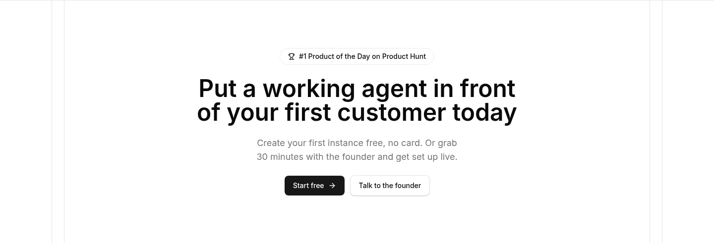
Cta|
A single-focus CTA gives the closing section one dominant action, with nothing that competes for the click at the moment a visitor is finally ready to move.
Key takeaways
Showing 22–42 of 369 examples

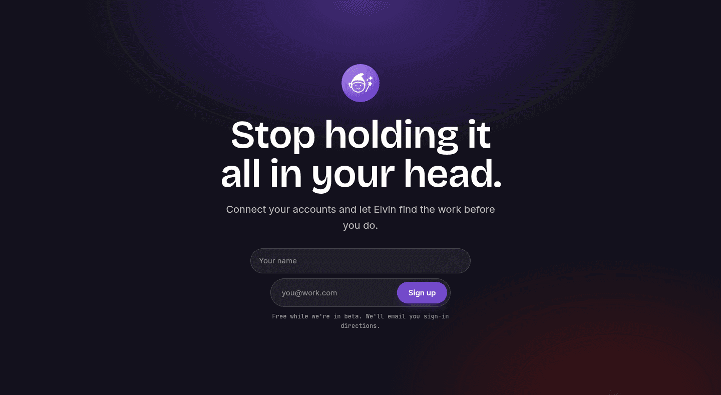
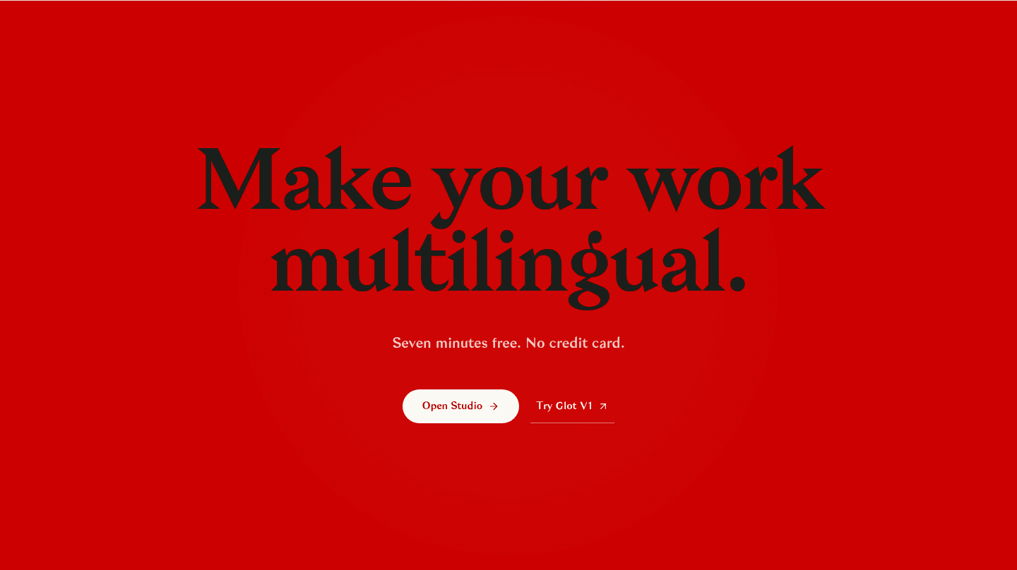
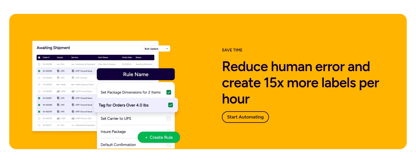

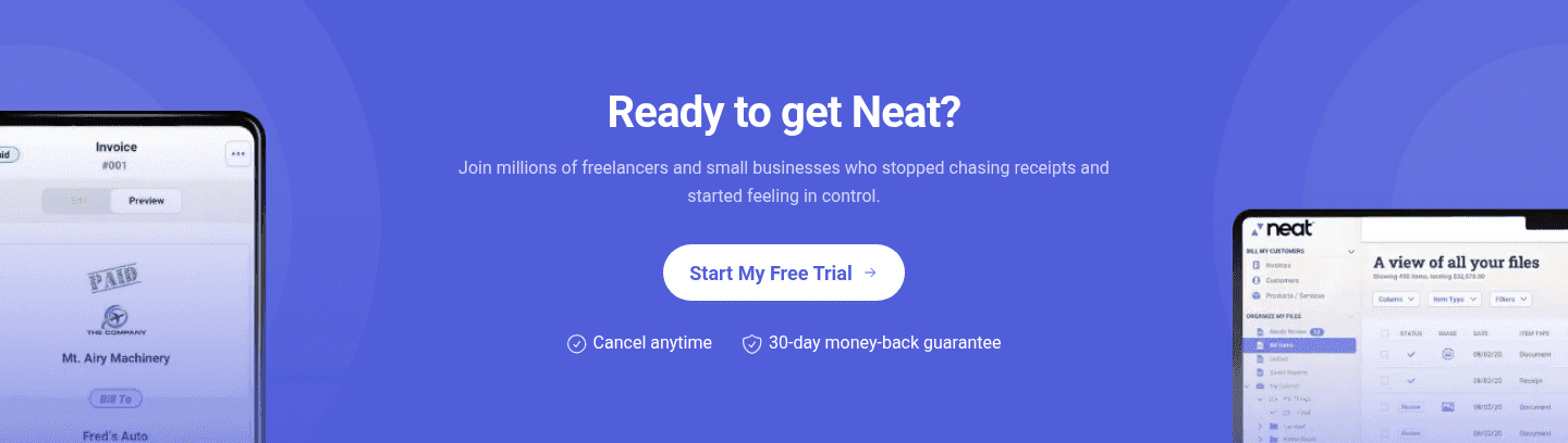

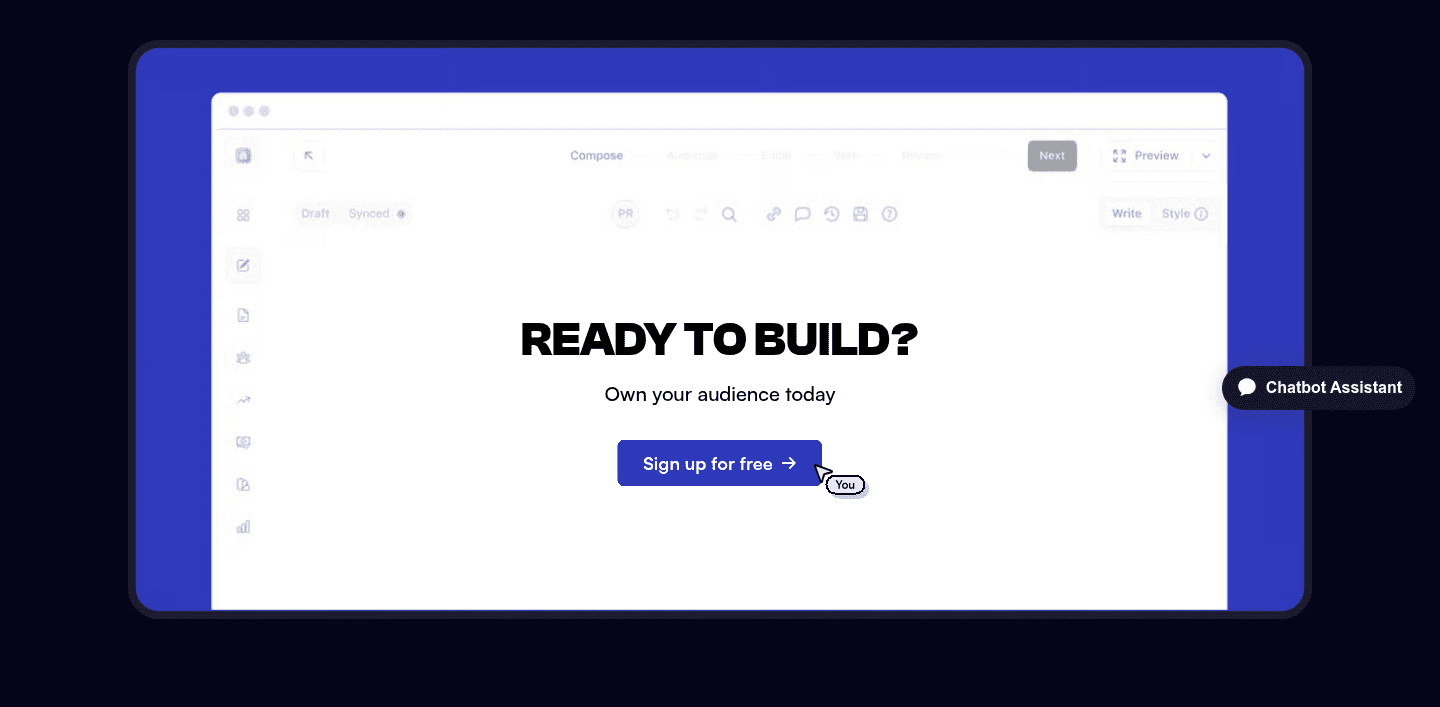
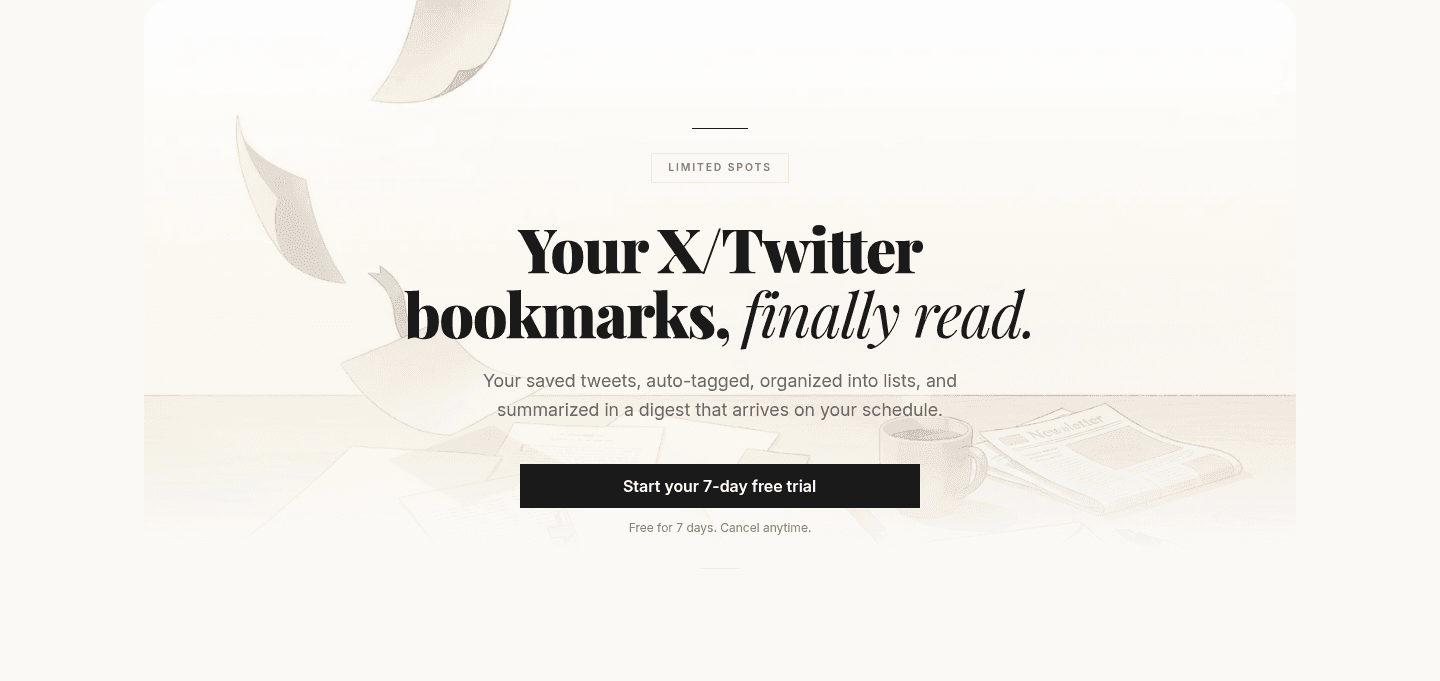


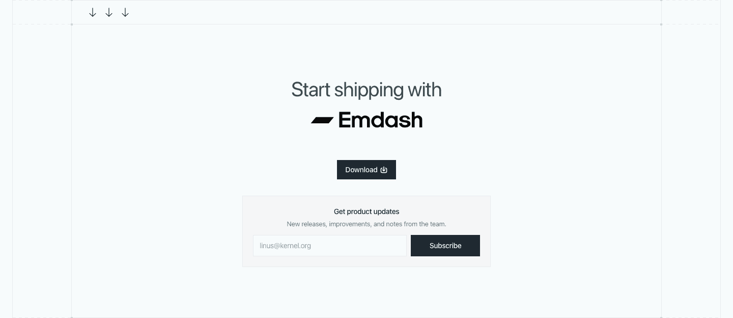


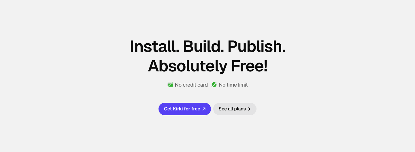
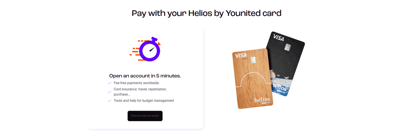

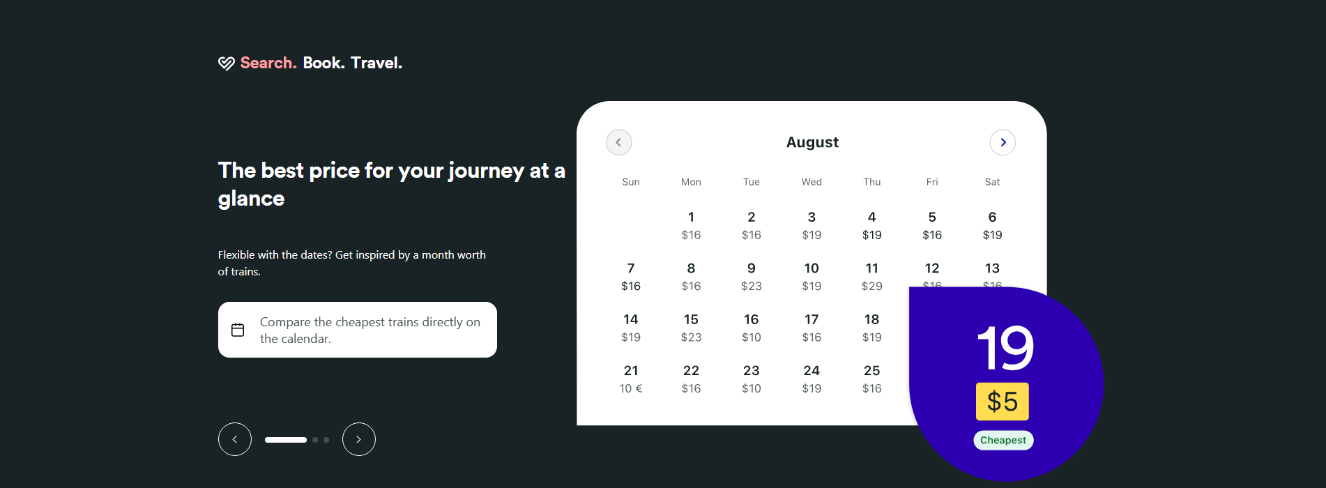

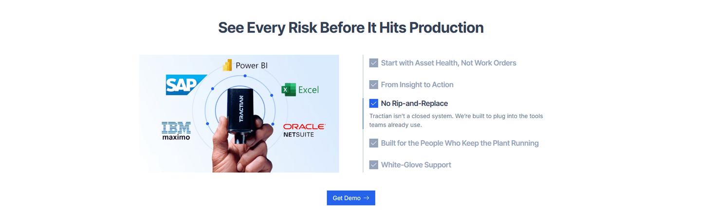
Browse every cta pattern by UX best practice.
Every CTA section is scored across 6 conversion best practices. See which ones stack friction reducers, microcopy, and secondary paths, not just which ones look clean.
Hand-picked from 650+ companies and analyzed by our AI conversion agent. Real CTA sections from real products, not UI kit mockups.
Found a CTA you want to beat? Run yours through the same scoring engine and see where you stand on the same best practices, and what to fix first.
A single-focus CTA is the decision to give the closing section one dominant action and let nothing else compete for the click. By the time a visitor reaches the bottom of the page, they have read the argument. The section's only job now is to make acting the easy, obvious next move. One button, clearly ranked above everything around it, does that. A cluster of equally loud links does the opposite.
The pattern shows up in a few concrete forms:
A visitor who scrolls to the closing section has, more often than not, already decided. What remains is the mechanical act of clicking. The more the section respects that, the more of that intent survives. One dominant button means there is nothing to compare and nothing to weigh, so the moment stays frictionless.
Competing links do quiet damage. When a second option carries the same visual weight as the first, the visitor has to stop and decide which one is for them, and that pause is where a warm decision cools. This is why the discipline matters more than it looks: leading with a single action is common, but the sections that hold the line, keeping the primary unmistakably dominant, are the ones that close cleanly. The minority that let a rival link match the primary in weight trade a simple click for a small, avoidable choice.
Most of the closing sections in the library lead with a single dominant action, so single focus is table stakes rather than an edge. The edge is in the execution. Across the scored examples below, the strongest sections do more than include one button. They isolate it. Tettra runs a single "Create your knowledge base" with no competing buttons. Bulkmark lets one black "Start your 7-day free trial" dominate an otherwise empty composition with zero competing actions. mailX by mailwarm elevates its single "Run the full deliverability test" on a dark card that lifts the whole block above the lighter sections around it, so the decision point is visually unmistakable.
One action rarely closes alone. The strongest sections pair it with reassuring microcopy sitting right under the button to remove last-second doubt, and, when a second audience genuinely needs it, a clearly lighter secondary path that supports the primary instead of rivaling it. The rule is the same in both cases: one action stays dominant, everything else recedes.
80/100 0/100
0/100The usual failure is a second link that competes instead of supporting. A secondary button styled as loud as the primary, a row of five equally weighted footer links, or a full nav bar hovering right above the CTA all split the decision the section was supposed to make simple. The second failure is a primary that does not actually dominate: a low-contrast button that blends into the background, or a "Learn more" link sitting at the same visual weight as "Start free". The fix is rarely to strip every other option away. It is to rank them, so one action is unmistakably the point and the rest quietly step back.

Curated by
Gabriel Amzallag , Founder, Web Anatomy
5 years CRO + SEO at Qonto (2021–2025). After advising 15+ SaaS on their websites (Payfit, Pigment…), the same patterns kept breaking, so I decided to build the source of truth on what works on the web: the intelligence layer every tool, builder, and team uses to ship sites that perform.
Paste your URL. Get a scored analysis of your CTA section, including whether one action stays dominant or the decision gets split. Free, no signup.
The common questions about building a closing section around one clear action, with answers drawn from 369 scored examples.
It is a closing call-to-action section built around one dominant action, with no competing buttons or links pulling the visitor in other directions. The forms it takes are a lone high-contrast button, a strong primary paired with a much lighter secondary link, an inline email field with a single submit, or a download button with quiet alternative paths underneath. In every case, one action is unmistakably the point of the section.
A visitor who reaches the closing section has usually decided to act. The job of the section is to make acting effortless. When one button clearly owns the moment, there is nothing to weigh and the decision is immediate. When two or three links share the same weight, the visitor has to compare them first, and that small pause is where intent leaks away.
Yes, as long as the second option is visibly lighter than the first. A dominant filled button next to a plain text link or an outlined button still reads as one clear action, because the eye lands on the primary first. The pattern breaks only when both options look equally important, so the visitor cannot tell which one they are supposed to press.
Centered and high-contrast, with the surrounding space working to isolate it. The strongest closing sections give the button room, lift it above the page with a darker card or a bold color, and keep supporting copy short so nothing crowds the click. The goal is that a visitor scanning the bottom of the page sees exactly one thing to do.
Adding a second link that competes with the primary instead of supporting it. A footer of five equally weighted links, a secondary button styled as loud as the first, or a nav bar sitting right above the CTA all split the decision. The fix is not removing every other option, it is ranking them, so one action stays dominant and the rest recede.