
Cta|
A secondary path catches the visitors who are not ready for the primary button, and 153 of the CTA sections we scored pair a dominant action with a lighter second option.
Key takeaways
Showing 64–84 of 153 examples

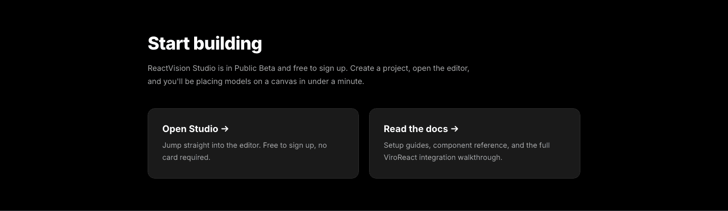
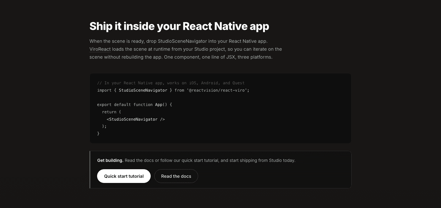

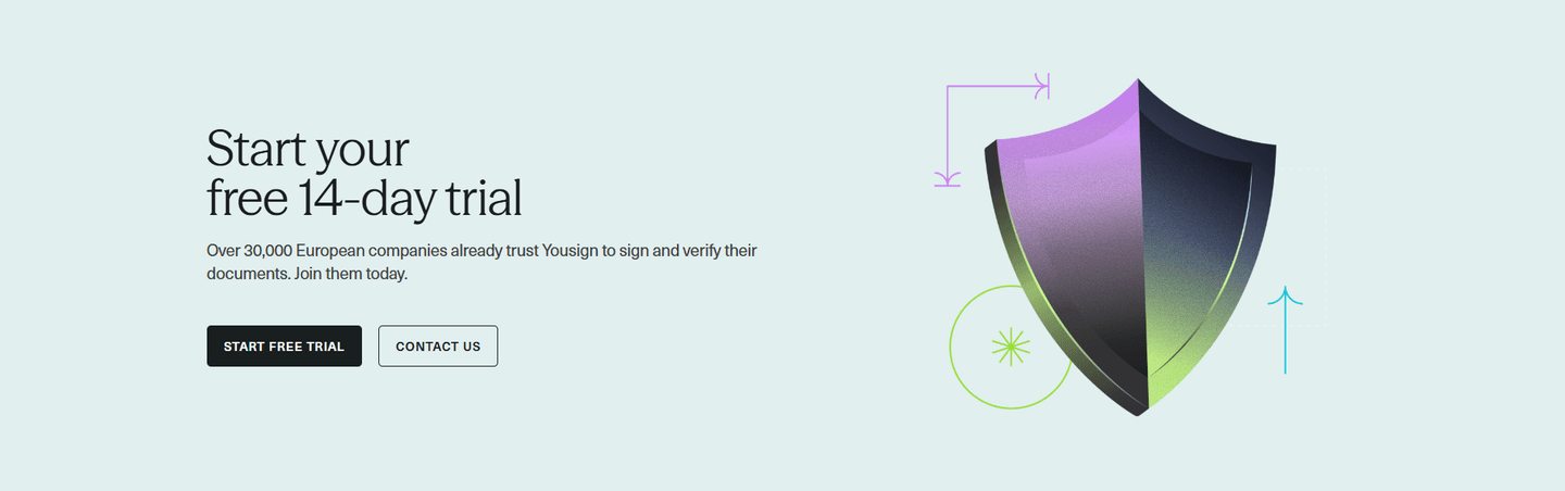
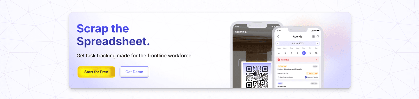


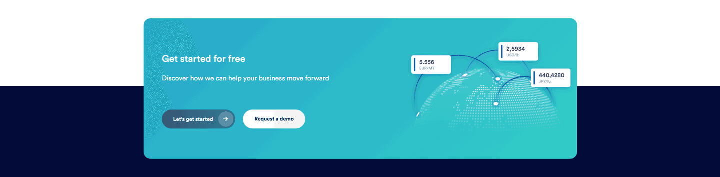
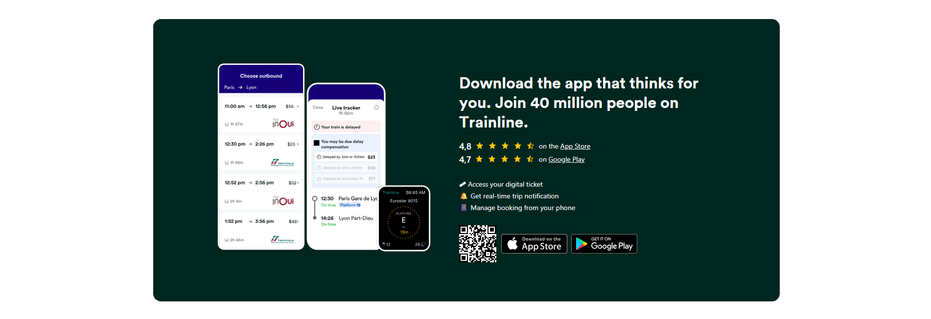
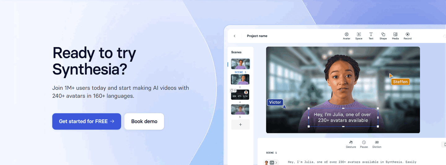
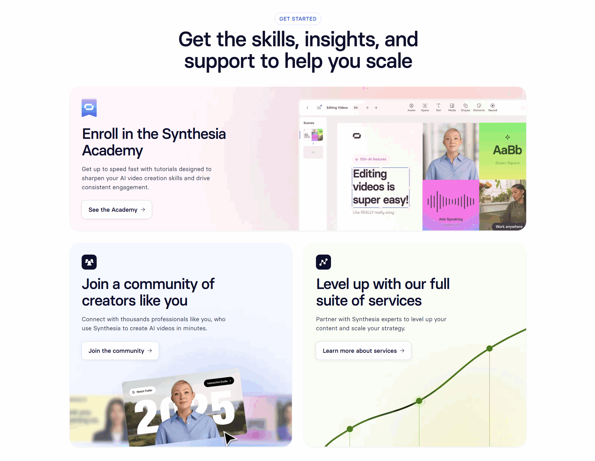

Browse every cta pattern by UX best practice.
Every CTA section is scored across 6 conversion best practices. See which ones stack friction reducers, microcopy, and secondary paths, not just which ones look clean.
Hand-picked from 650+ companies and analyzed by our AI conversion agent. Real CTA sections from real products, not UI kit mockups.
Found a CTA you want to beat? Run yours through the same scoring engine and see where you stand on the same best practices, and what to fix first.
A secondary path is the lighter link or outlined button placed next to the dominant call to action. The primary button says "do this now." The secondary path says "and if you are not ready for that, here is where else to go." When both sit in the same row, the section stops betting everything on one level of readiness and starts serving the whole audience.
The best CTAs point the second path at one of a few real reasons to hesitate:
Visitors do not all arrive at the same point. One is ready to start a trial, one wants to see the price before signing up, and one wants a walkthrough before trusting the product at all. A section with a single button serves only the first of those three and quietly loses the other two, who had real interest but no next step that fit them.
The second path closes that gap. It gives the undecided visitor a move that matches where they actually are, so instead of leaving to "come back later," they book the demo, open the pricing, or read the docs and stay in motion. The primary button still owns the moment for the ready buyer; the secondary path just keeps everyone else from falling off the edge of the page.
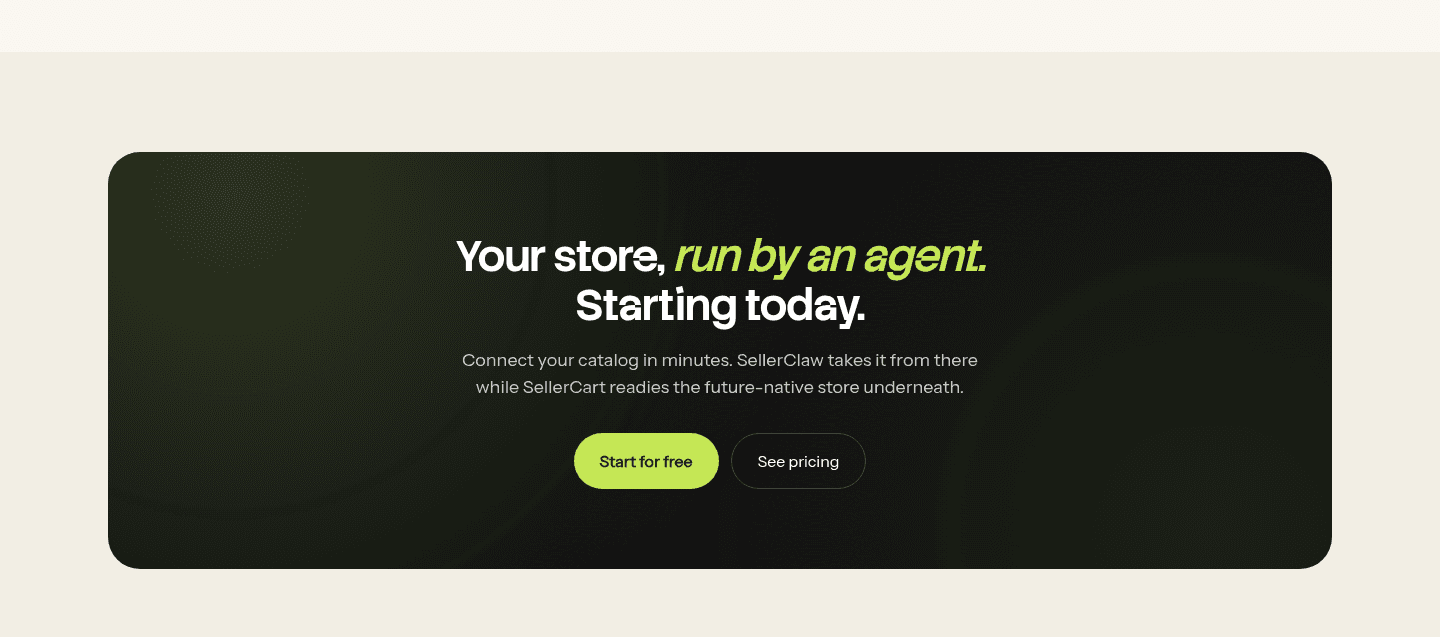
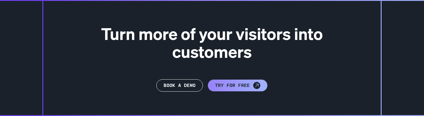
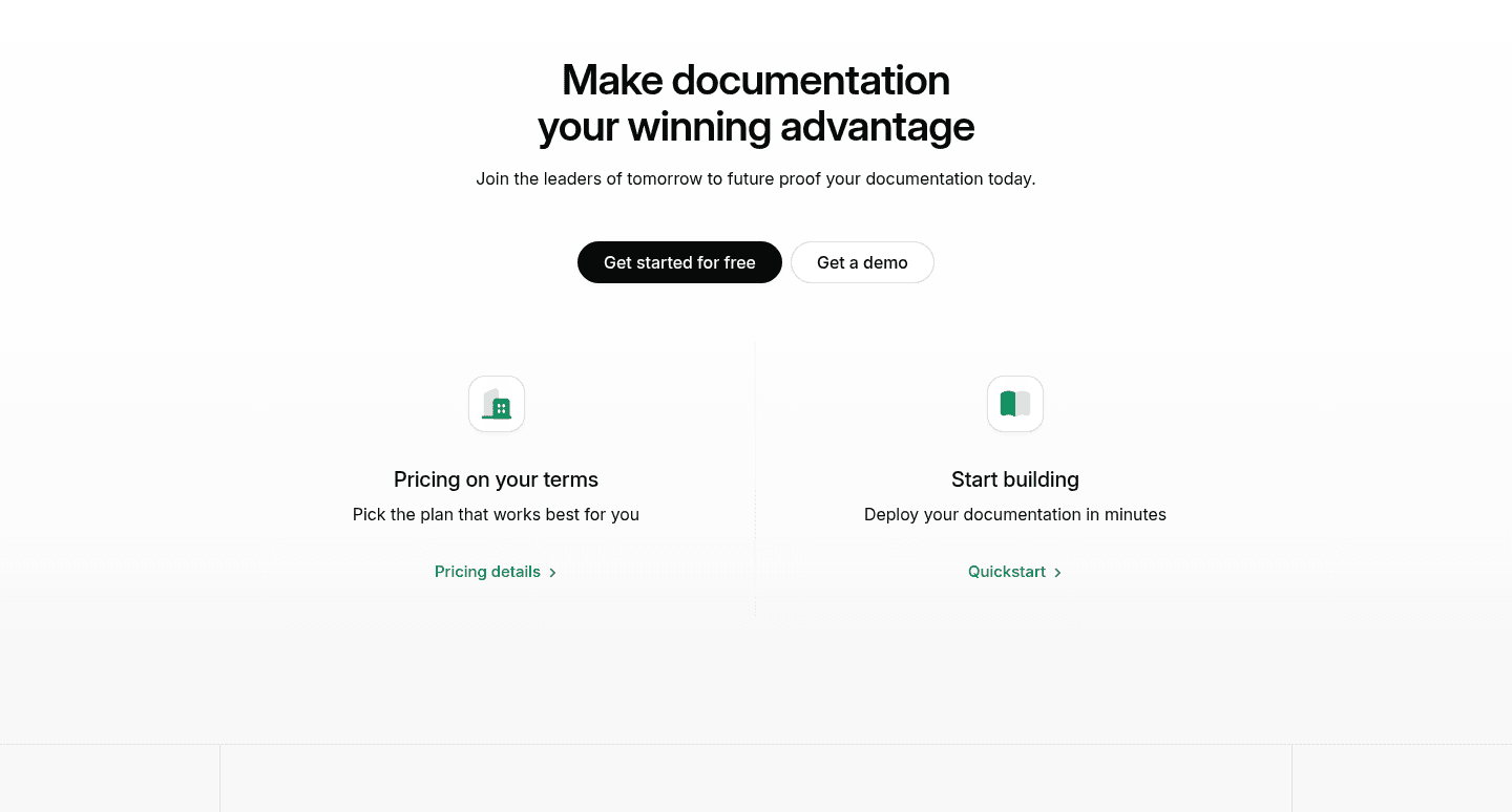
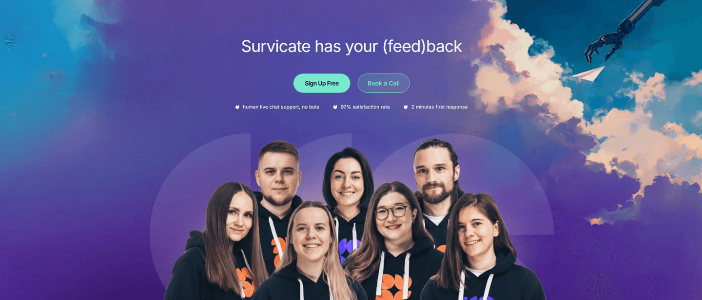
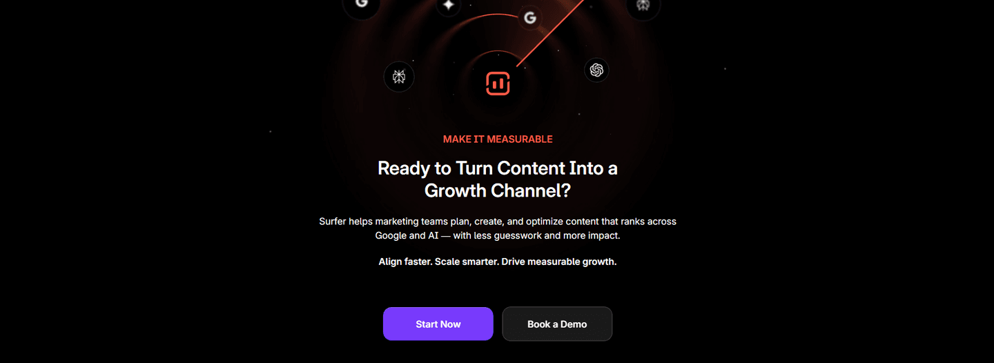
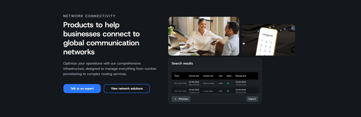
Just under half of the scored CTA sections in our library carry a secondary path, and the ones that work share a single discipline: a clear hierarchy. Texau pairs a filled "See the MCP catalog" with a lighter "Read the API docs" link, so the ready developer and the researching one each get their door. Perfai Security keeps a gradient "Start free" plainly ahead of an outlined "Book a demo," and Agent 37 Cloud does the same with a solid black "Start free" above a muted "Talk to the founder, 30 minutes with the founder." In every case one action is obviously first, and the second is obviously optional.
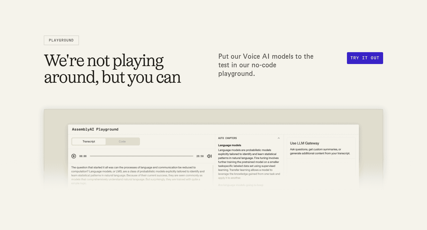
The pattern holds across the reasons a visitor stalls. Firecrawl and Stackerhq send evaluators to "See our plans" and "See plans" next to a dominant free-start button, while StoreClaw offers a plain "View pricing" for the same job. Deep and Octolens hold a "Book a demo" beside their primary for buyers who want a guided look, and Toyo and Tigerhall use "Explore" and "Explore the Model" to give the still-curious a low-stakes way in. A secondary path also pairs naturally with reassuring microcopy on the primary button, which clears the last doubt for the visitor who does pick the main action. The examples below show the two-path layout in context, with the hierarchy doing the work.
60/100 0/100
0/100The usual failure is two buttons of equal weight, where nothing is clearly first and the visitor has to decide which one the page even wants them to click. A secondary path only helps when it looks secondary: lighter, outlined, or a text link, never a twin of the primary. The second failure is a path that leads nowhere useful, a vague "Learn more" that dumps the visitor into a page with no next step of its own. The third is quantity, three or four side-by-side actions that turn one clear choice into a menu no one finishes reading. Keep one dominant button, offer one lighter path aimed at a real hesitation, and make the hierarchy impossible to miss.

Curated by
Gabriel Amzallag , Founder, Web Anatomy
5 years CRO + SEO at Qonto (2021–2025). After advising 15+ SaaS on their websites (Payfit, Pigment…), the same patterns kept breaking, so I decided to build the source of truth on what works on the web: the intelligence layer every tool, builder, and team uses to ship sites that perform.
Paste your URL. Get a scored analysis of your call to action, including whether your second path catches the visitors who aren't ready for the main button. Free, no signup.
The common questions about the lighter path beside the button, with answers drawn from 153 scored examples.
It is the lighter link or outlined button offered next to the dominant call to action, for the visitor who is interested but not ready to take the main action. The most common forms are a demo or a call ('Book a demo', 'Talk to the founder'), a pricing link ('See plans', 'View pricing'), a documentation or how-it-works link, or a lower-commitment way into the product ('Explore', 'Try for free').
Not every visitor arrives at the same readiness. Some are ready to start, some want to see the price, and some want a human before they commit. A single button serves only the first group and quietly loses the rest. A lighter second path gives the undecided visitor a next step that fits where they actually are, so they stay on the site instead of leaving to 'think about it'.
Only when the two compete. The rule the best examples follow is one clear hierarchy: the primary action is filled and bold, the second path is lighter, outlined, or a plain text link. Perfai Security keeps a gradient 'Start free' clearly ahead of an outlined 'Book a demo'; Agent 37 Cloud sets a solid black 'Start free' above a muted 'Talk to the founder'. The visitor still sees one obvious first choice, with a fallback for the rest.
Point it at the reason a visitor would hesitate on the primary action. If the fear is commitment, a demo or a call works, as with Deep's 'Book a demo' beside 'Find your tech fit'. If the visitor needs numbers, a pricing link fits, as with Firecrawl's 'See our plans' or StoreClaw's 'View pricing'. If they are still learning, a docs or explore link fits, as with Texau's 'Read the API docs' or Toyo's 'Explore'.
Usually two: one dominant primary and one lighter secondary. That covers the ready buyer and the undecided one without splitting attention. A third or fourth equal button turns a clear decision into a menu, and the visitor who has to choose between four options often chooses none. Lead with one action, offer one alternative, and keep the hierarchy obvious.