
Cta|
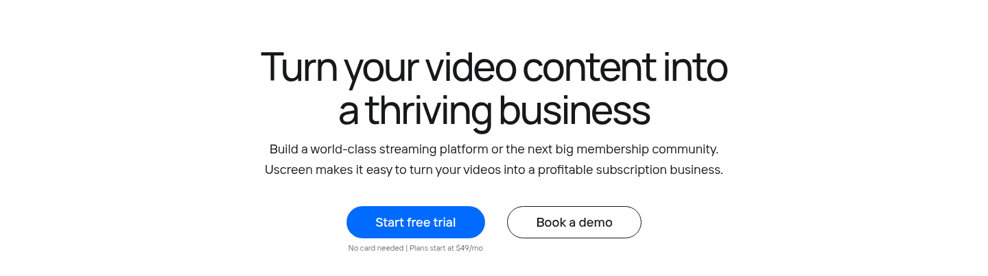
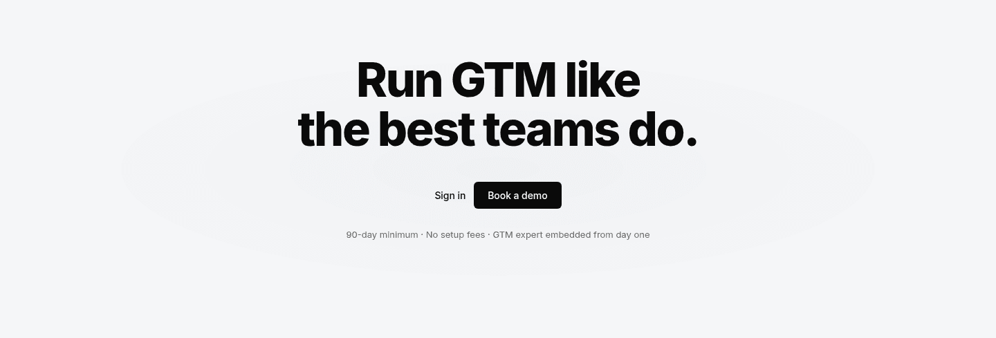
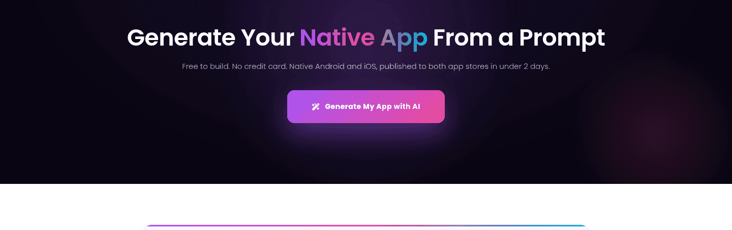
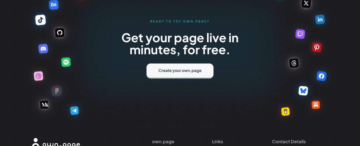
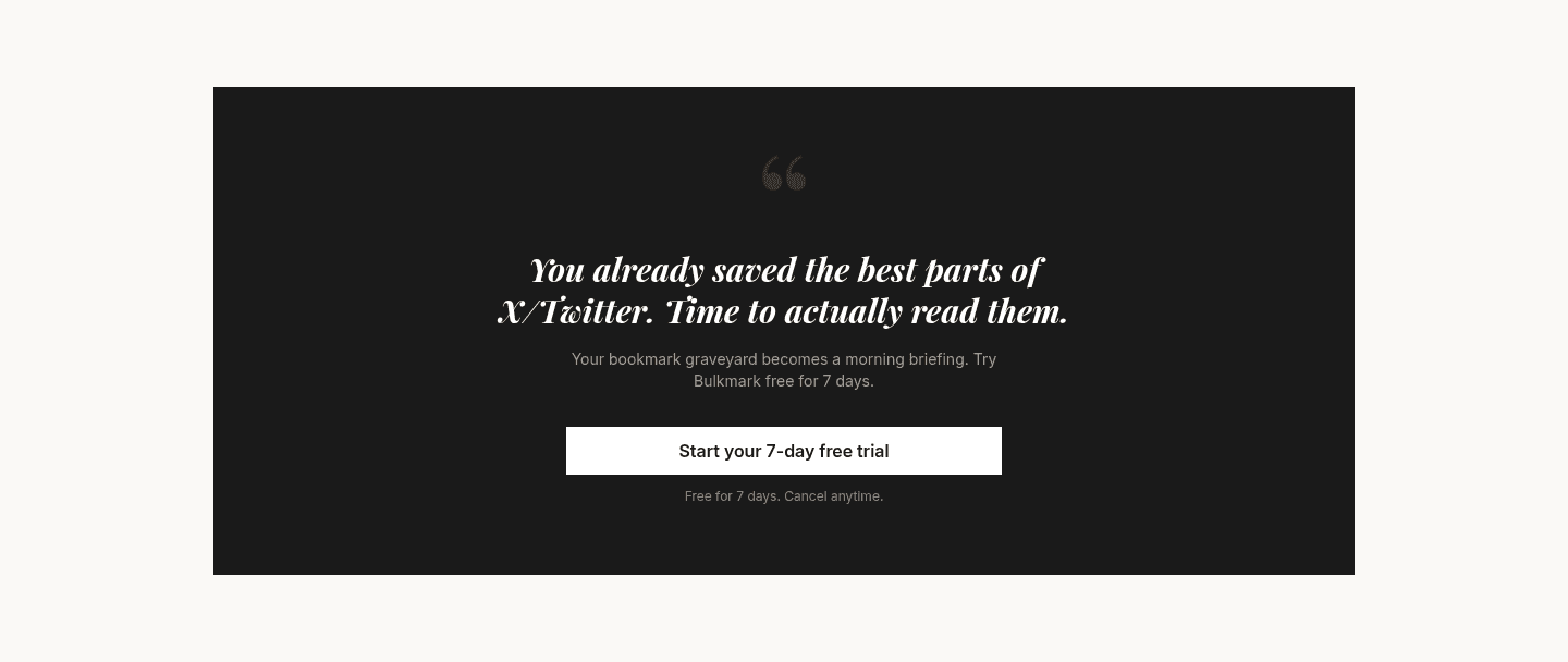
Reassuring microcopy defuses last-second doubt with a short line beside the button, and 91 of the CTA sections we scored use it to turn intent into a click.
Key takeaways
Showing 64–84 of 91 examples












Browse every cta pattern by UX best practice.
Every CTA section is scored across 6 conversion best practices. See which ones stack friction reducers, microcopy, and secondary paths, not just which ones look clean.
Hand-picked from 650+ companies and analyzed by our AI conversion agent. Real CTA sections from real products, not UI kit mockups.
Found a CTA you want to beat? Run yours through the same scoring engine and see where you stand on the same best practices, and what to fix first.
Reassuring microcopy is the short line of text placed next to a call-to-action button that answers the last question in a visitor's head before they click. The button says "do this." The microcopy says "and here is why it costs you nothing to try." When both sit in the same glance, the action stops feeling like a commitment and starts feeling like a look around.
The best CTAs answer one of three worries, sometimes more than one at once:
A visitor who is ready to act still hesitates for a beat, running a quiet checklist: will I get charged, am I stuck if I do not like it, how long is this going to take. Every question that goes unanswered becomes a reason to close the tab and "come back later," which usually means never. Reassuring microcopy answers those questions in the exact place and moment they come up, so the doubt never gets to slow the hand.
The placement is the whole point. A guarantee buried in the footer or a pricing FAQ reaches only the visitor who was already committed enough to go looking. The same words beside the button reach everyone, including the person whose finger was hovering and about to drift away.
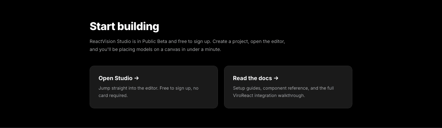
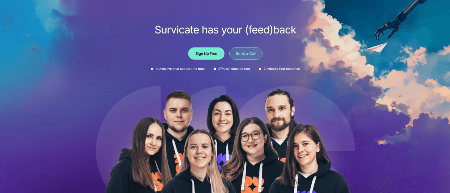
About a third of the scored CTA sections in our library carry a reassuring line, and the ones that land share a discipline: the copy names the exact worry and answers it in plain words. Tettra stacks three answers under one button (Free 30-day trial, No credit card required, All features included), each removing a different reason to hesitate. Texau does it in a plain "Failed lookups free, No annual commit" that defuses a pricing fear and a lock-in fear in the same breath. Stackerhq goes blunt with "No credit card, no sales call, no catch," and CtrlOps mirrors it with "Start instantly, No credit card, No sneaky autorenewals."
Others reduce a different kind of cost. mailX pairs "Takes less than 10 seconds" with "No signup required" to kill time and friction in one line, while TaxGPT sets the time price right on the offer with "No signup required, 2 minutes." Spellar stacks three risk reducers under its price (all AI models included, cancel anytime, 14-day money-back), Vaani keeps it to two words of relief ("Seven minutes free. No credit card."), and StoreClaw folds the reassurance into the button label itself with "Start Free, No credit card required." The examples below show the line working in context, right where the eye lands on the button.
60/100 0/100
0/100The usual failure is vagueness: "risk-free" or "get started with confidence" sounds reassuring but names no actual worry, so it removes none. Concrete beats abstract every time, and a real detail like "No credit card" outperforms a mood. The second failure is distance, where the reassurance is technically on the page but a scroll away from the button, so it never shares the decisive glance. The third is contradiction, the line that promises "no credit card" above a form that asks for one, which does more damage than saying nothing at all. Name the real objection, keep the line next to the button, and make sure the product actually honors it.

Curated by
Gabriel Amzallag , Founder, Web Anatomy
5 years CRO + SEO at Qonto (2021–2025). After advising 15+ SaaS on their websites (Payfit, Pigment…), the same patterns kept breaking, so I decided to build the source of truth on what works on the web: the intelligence layer every tool, builder, and team uses to ship sites that perform.
Paste your URL. Get a scored analysis of your call to action, including whether the copy near your button removes hesitation. Free, no signup.
The common questions about the line of text near the button, with answers drawn from 91 scored examples.
It is the short line of text placed next to a call-to-action button that removes the last hesitation before a click. The most common forms answer a specific worry: cost ('No credit card required', 'Free 14-day trial'), commitment ('Cancel anytime', 'No annual commit'), or time and effort ('No signup required', 'Takes less than 10 seconds').
A visitor who is ready to click still runs a quick mental checklist: will I get charged, am I locked in, how long will this take. Every unanswered question is a reason to leave and 'think about it'. A short line beside the button answers those questions at the exact moment they surface, so intent turns into a click instead of a bounce.
Name the specific objection the visitor is feeling and answer it in plain words. For a free trial, the fear is a surprise charge, so 'No credit card required' lands harder than 'risk-free'. For a paid plan, the fear is lock-in, so 'Cancel anytime' or a money-back window works. For a tool or demo, the fear is time, so 'No signup required' or a stated duration removes it.
Directly under or beside the button, so the eye reads the reassurance in the same glance as the action. Some pages go further and fold it into the button label itself, for example StoreClaw's 'Start Free, No credit card required'. The line loses its power when it drifts into a paragraph the visitor has to hunt for.
Enough to clear the real objections without turning into a list. One strong line is often plenty. Stacking works when each item removes a different worry, as with Tettra's 'Free 30-day trial, No credit card required, All features included' or Stackerhq's 'No credit card, no sales call, no catch'. Three unrelated reassurances read as reassuring, but five reads as protesting too much.