Cta|
A real screenshot, interface mockup, or concrete deliverable next to the button shows visitors exactly what they get before they commit.
Key takeaways
Showing 43–63 of 140 examples



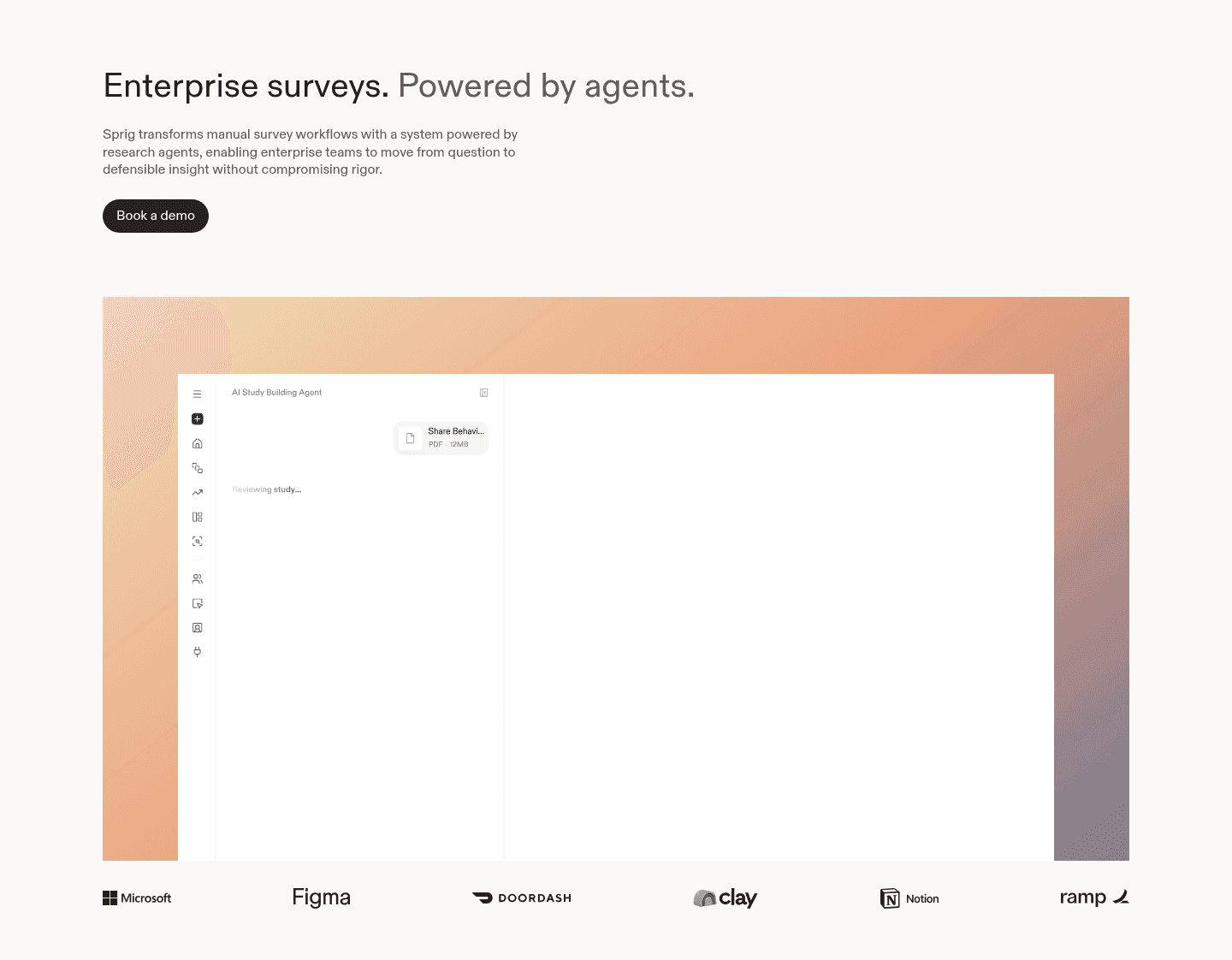
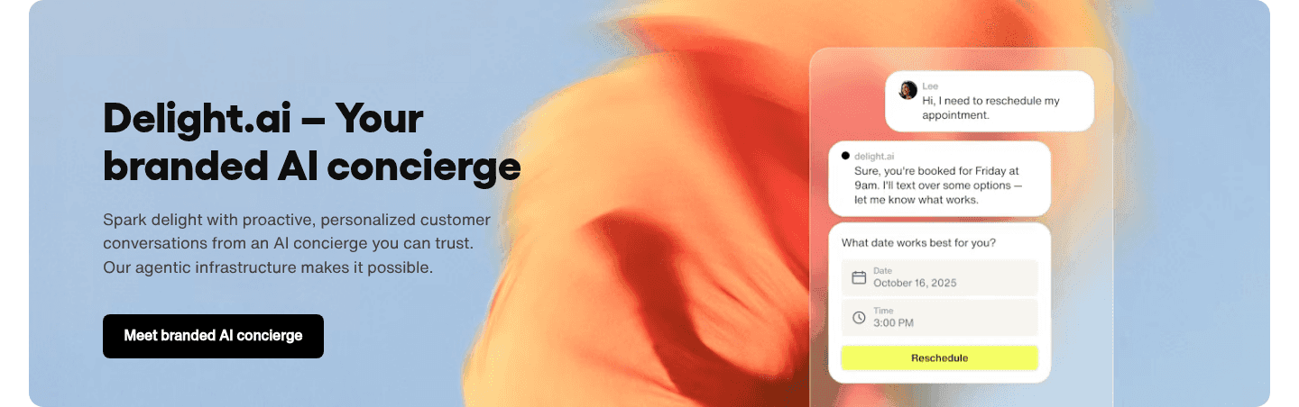
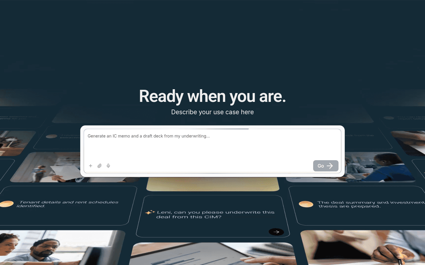
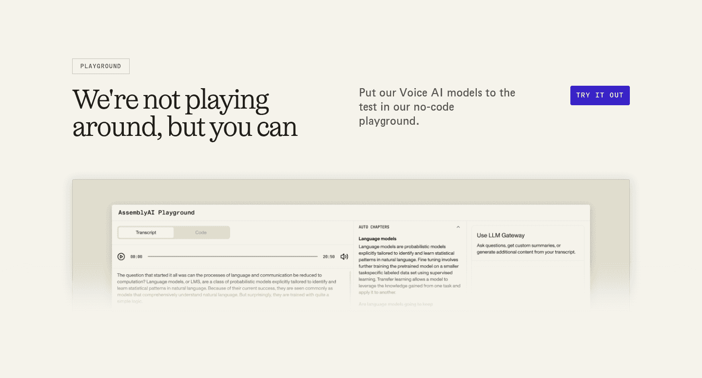
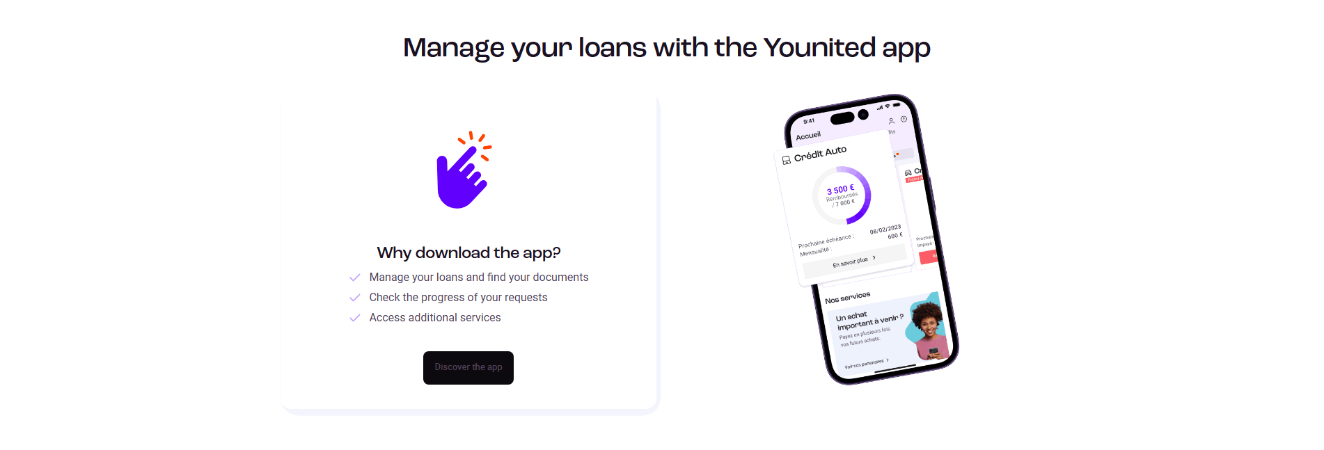
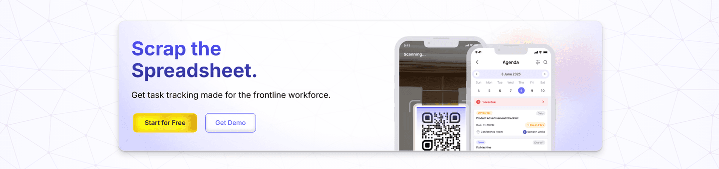
Browse every cta pattern by UX best practice.
Every CTA section is scored across 6 conversion best practices. See which ones stack friction reducers, microcopy, and secondary paths, not just which ones look clean.
Hand-picked from 650+ companies and analyzed by our AI conversion agent. Real CTA sections from real products, not UI kit mockups.
Found a CTA you want to beat? Run yours through the same scoring engine and see where you stand on the same best practices, and what to fix first.
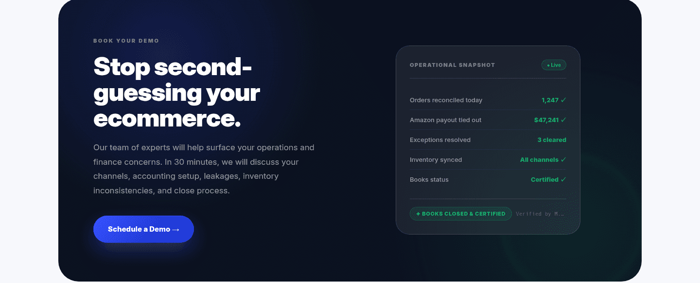
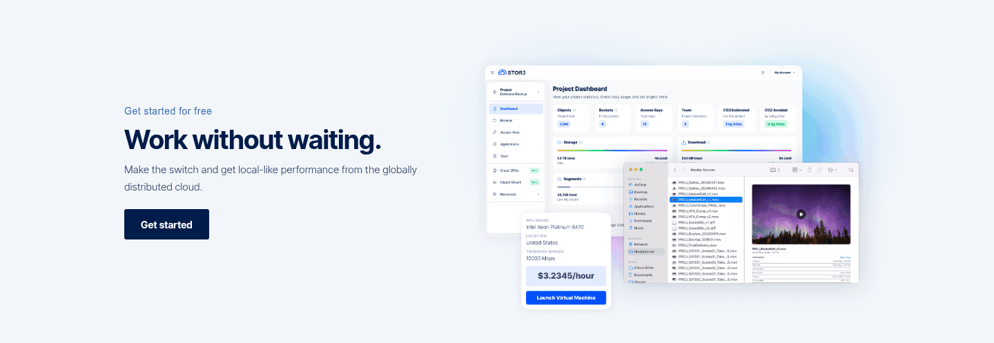
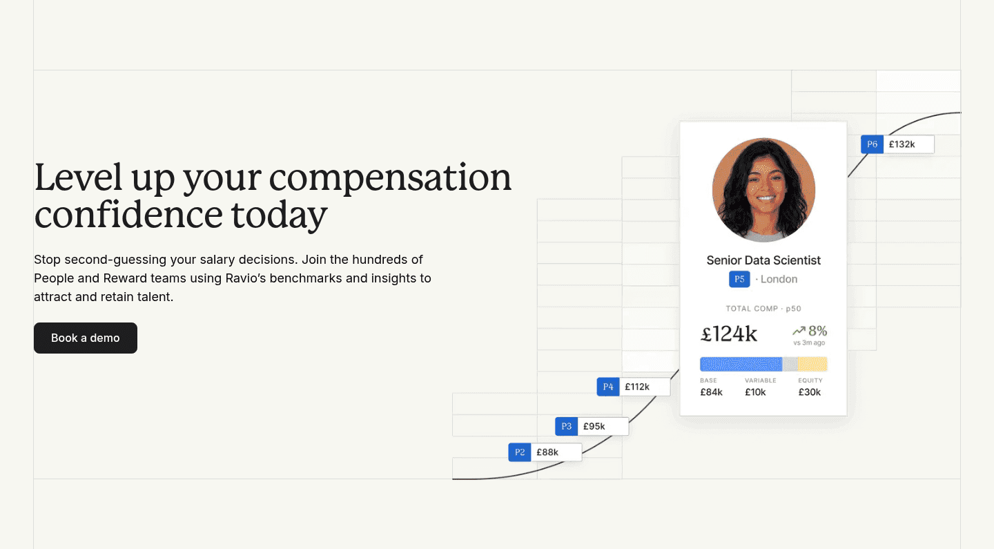
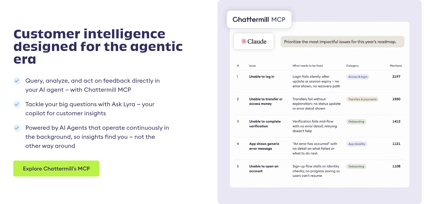
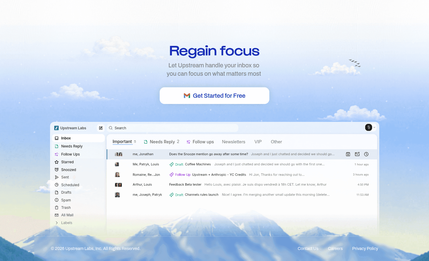
A product visual at the call to action is the choice to show the real thing next to the button, in the moment a visitor decides whether to act. A button on its own is an invitation. The same button beside a screenshot of the live interface, or a preview of the report about to be downloaded, is an invitation with the answer to "what do I actually get" already attached.
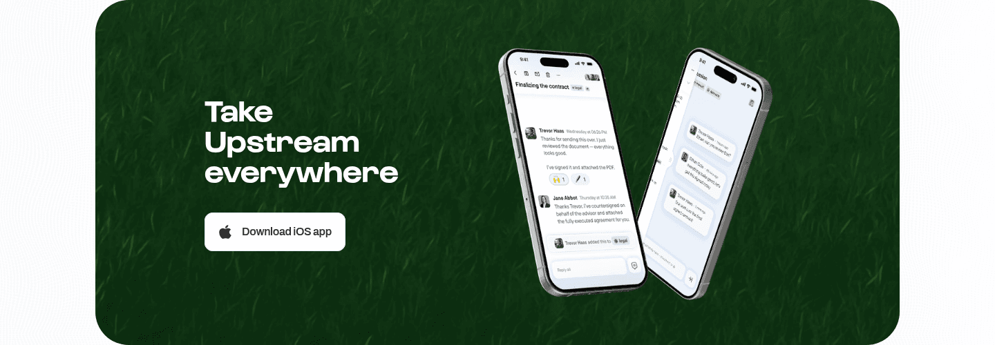
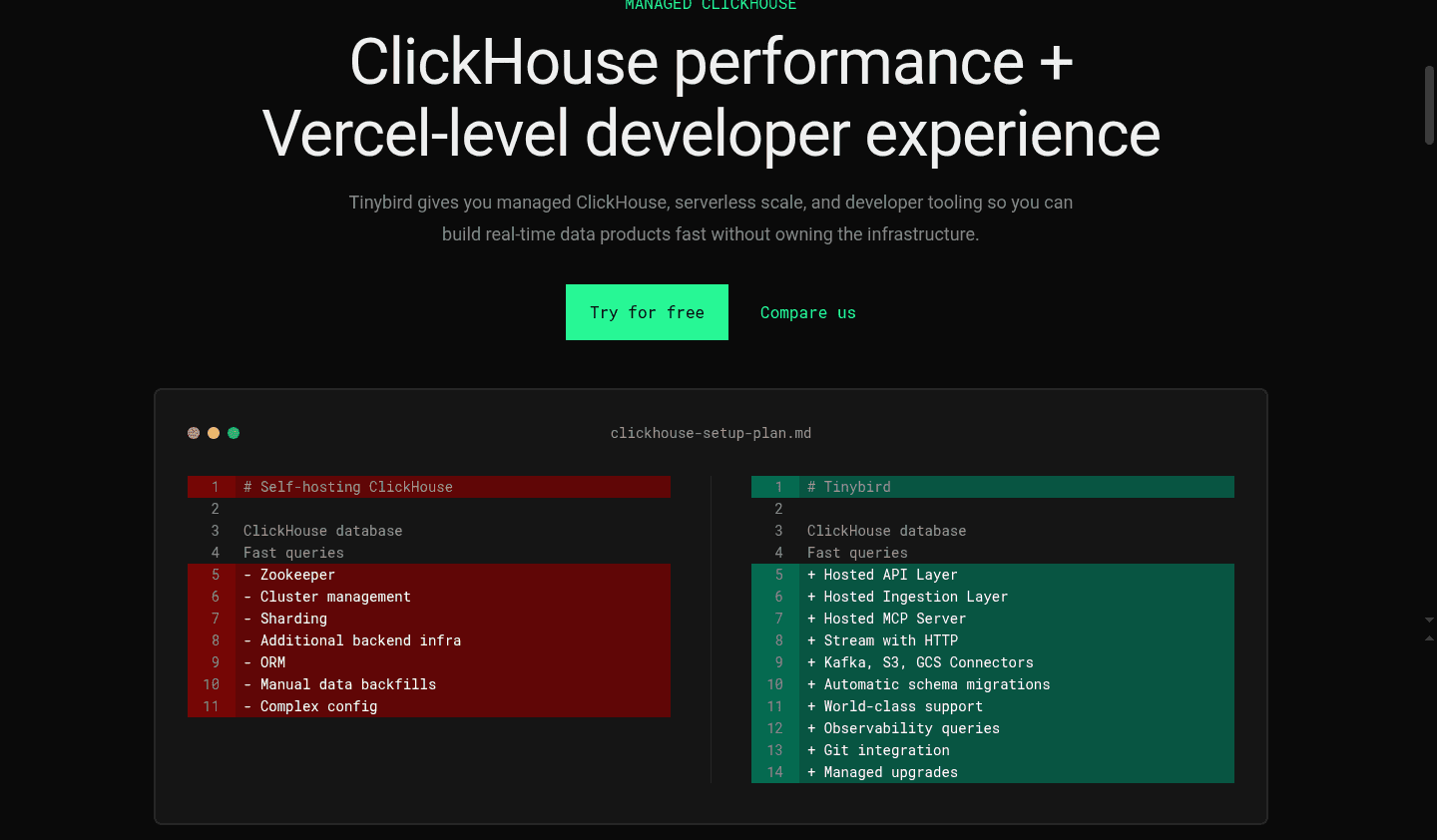
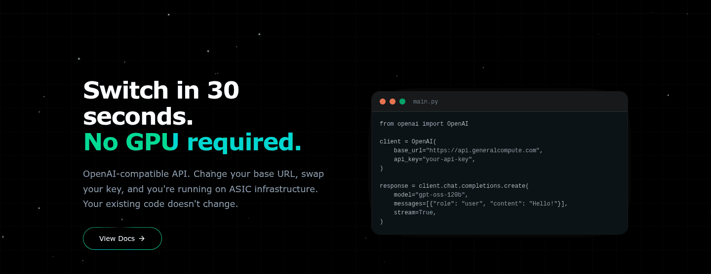
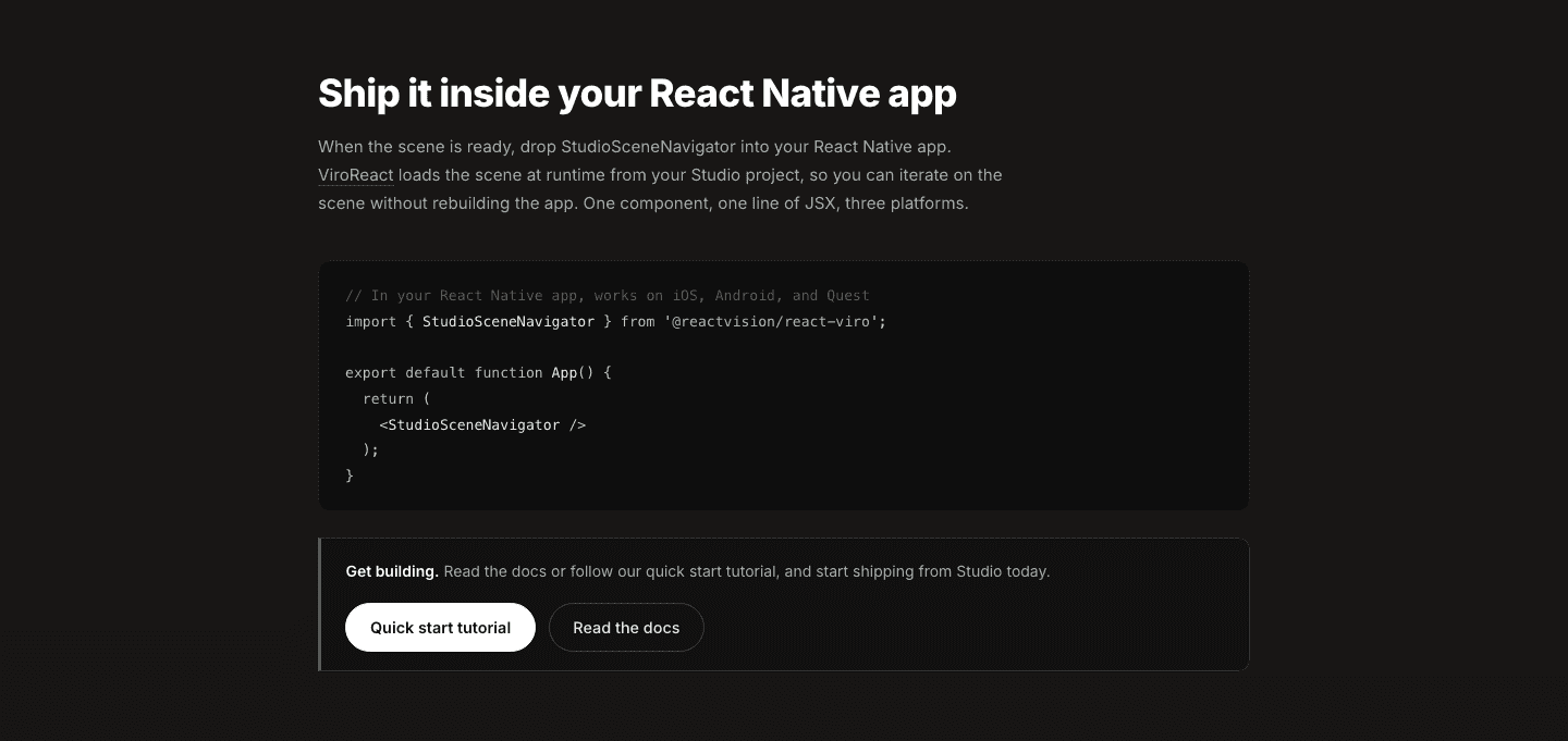
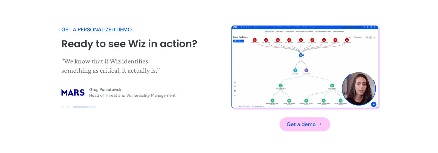
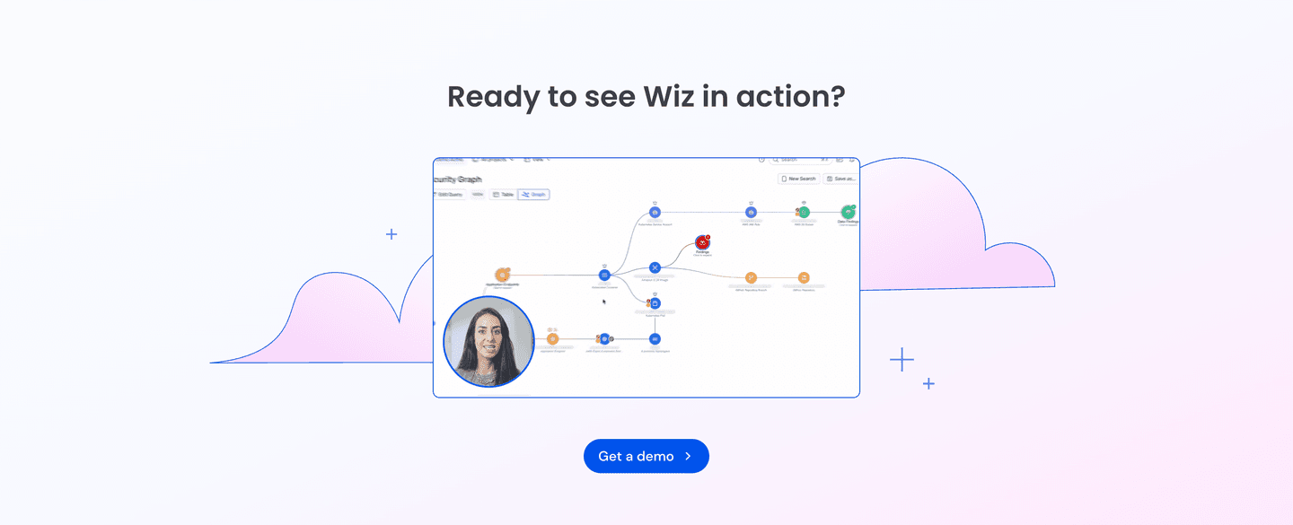
The best closing sections use one of four forms:
The closing section is the last thing a visitor reads before they decide. By that point they have absorbed the pitch, and the open question is quieter: what happens after I click. A bare button leaves that question unanswered and asks for trust anyway. A button paired with a real screenshot or a preview of the deliverable answers it in a glance.
Seeing the actual product or asset also lowers the felt risk of committing. A generic illustration proves nothing, but a real interface says the product is built and working, and a report cover says the deliverable is real and ready. The visitor stops imagining what they might get and starts recognizing what they will get, which is a much shorter path to a click.
Across the scored examples below, the discipline is that the visual is the actual product, matched to the exact offer. When the offer is a free trial, the strongest sections show the interface: Mailmeteor sits its real deliverability dashboard and email editor beside a single button, and Pitch shows its desktop and mobile decks under the sign-up. When the offer is a download, they preview the deliverable itself, the way Shippit shows the cover of its delivery report and Tigerhall previews its maturity model document so the asset feels concrete before the click. In every case the image supports one dominant button rather than competing with it.
The visual rarely does the whole job alone. The best closing sections pair it with reassuring microcopy under the button to kill last-minute doubt, and offer a lighter secondary path for visitors who want a guided look before they start.
60/100 0/100
0/100The usual failure is a decorative image where a real one belongs: a stock illustration or an abstract graphic that fills the space next to the button but shows the visitor nothing about the product. The second failure is a visual that overpowers the action, a busy image or several competing buttons that pull the eye away from the one click that matters. And the third is a mismatch, where the picture shows something other than what the button unlocks. Show the real interface for a trial, the real cover for a download, and keep it in service of a single, clear action.

Curated by
Gabriel Amzallag , Founder, Web Anatomy
5 years CRO + SEO at Qonto (2021–2025). After advising 15+ SaaS on their websites (Payfit, Pigment…), the same patterns kept breaking, so I decided to build the source of truth on what works on the web: the intelligence layer every tool, builder, and team uses to ship sites that perform.
Paste your URL. Get a scored analysis of your closing section, including whether the product or deliverable is visible at the click. Free, no signup.
The common questions about showing the product or deliverable near the button, with answers drawn from 140 scored examples.
It means the closing section places a real image of what the visitor gets right next to the button. That can be a screenshot of the live dashboard, a mockup of the app on a phone, an inline code snippet, or the cover of a report or template on offer. The point is that the visual is the actual product or deliverable, not a stock illustration or an abstract graphic.
The closing section is the last thing a visitor reads before deciding. A button on its own asks for trust. The same button next to a real screenshot or a preview of the deliverable answers the quiet question of what happens after the click. Seeing the thing lowers the sense of risk at the exact moment the visitor is weighing whether to act.
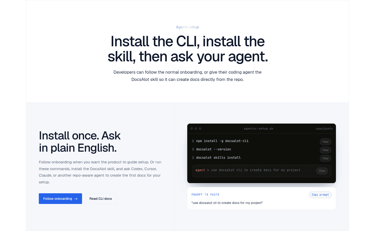
Four forms show up most often. A live product UI or dashboard beside the button, as Mailmeteor and Pitch do. A phone or device mockup of the real screen. An inline snippet or command for a developer tool. And a preview of the deliverable itself, like the report cover Shippit shows or the maturity model document Tigerhall previews when the offer is a download.
No. The visual supports the button, it does not rival it. The strongest closing sections keep one dominant call to action and use the product image to make that single action feel concrete. When the picture pulls attention away from the button, or when there are several buttons and an image all fighting for the eye, the section loses focus.
Rarely. A generic illustration fills space but proves nothing. A real screenshot or a preview of the deliverable does the work of showing the visitor what they are signing up for. If the offer is a free trial, show the interface. If it is a report, show the cover. Match the visual to the exact thing the button unlocks.
