Comparison|
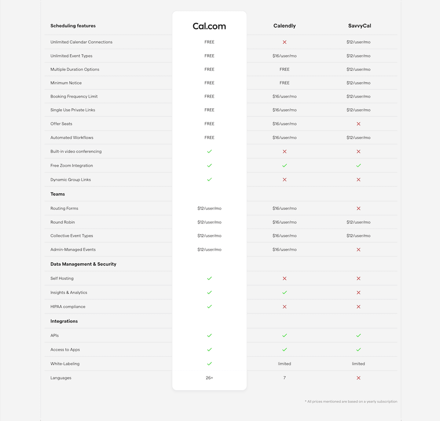
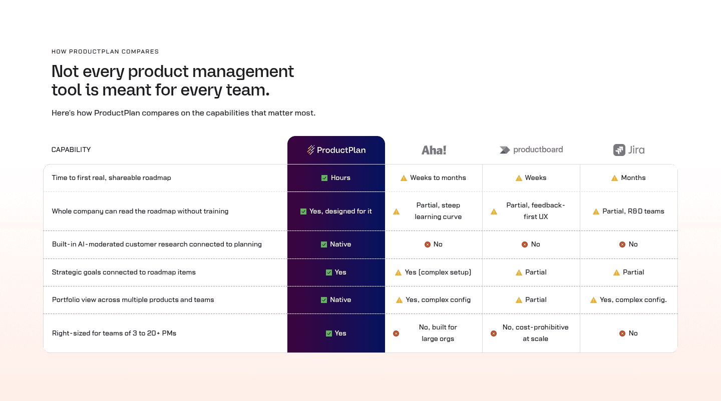
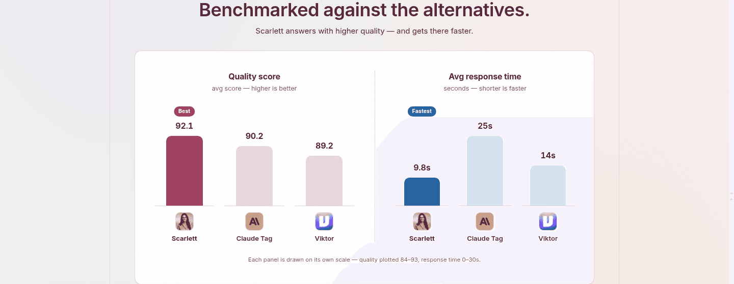
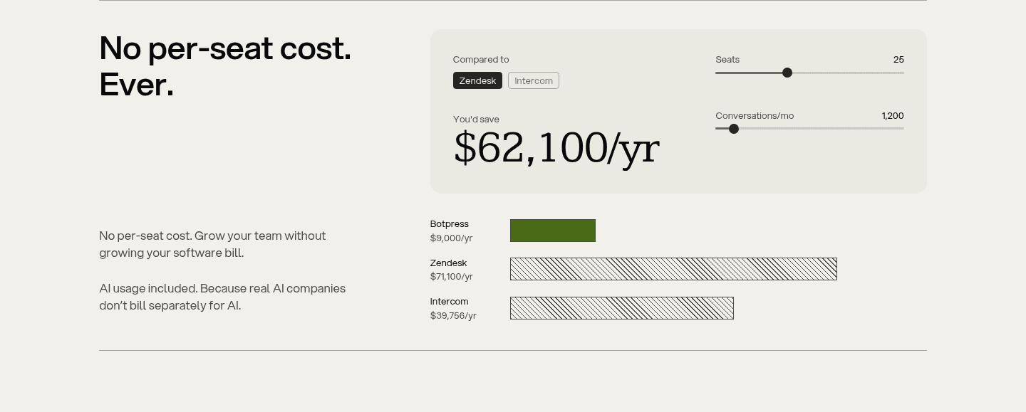
A multiple comparison puts the product next to several named alternatives in one table, so a visitor weighing a shortlist can see where it wins in a single scroll.
Key takeaways
Showing 1–18 of 18 examples
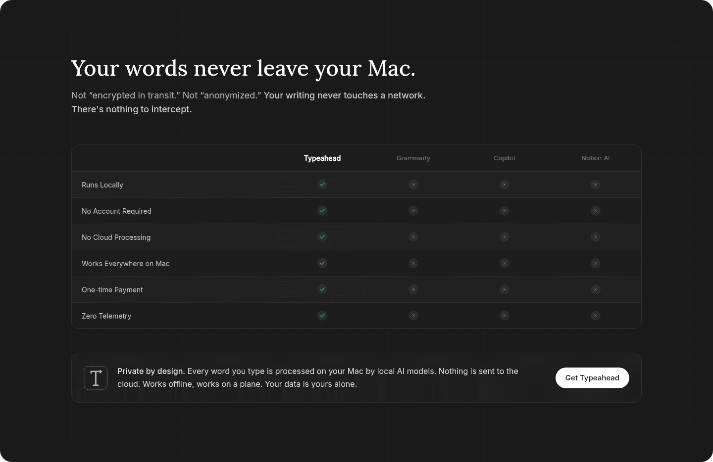
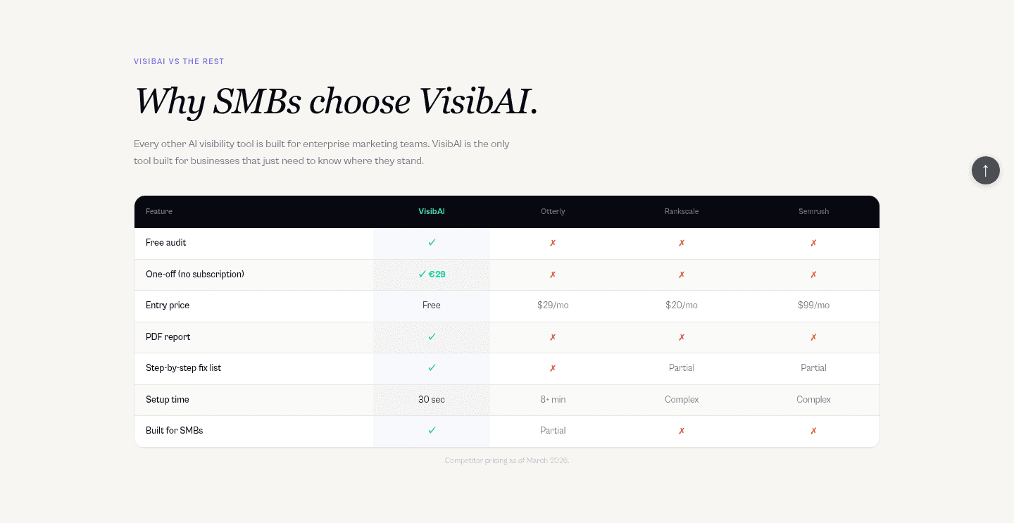
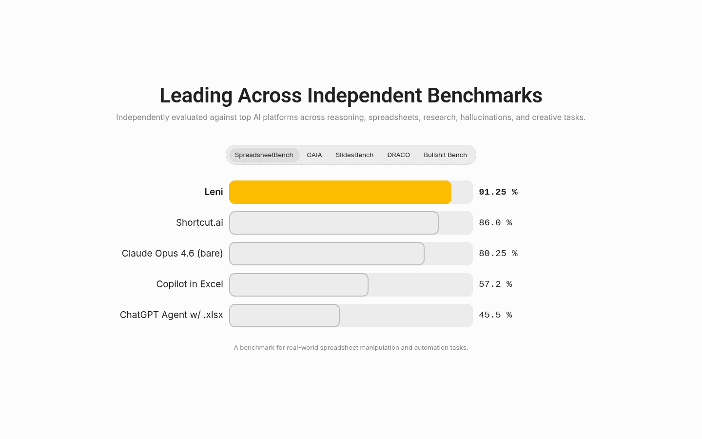
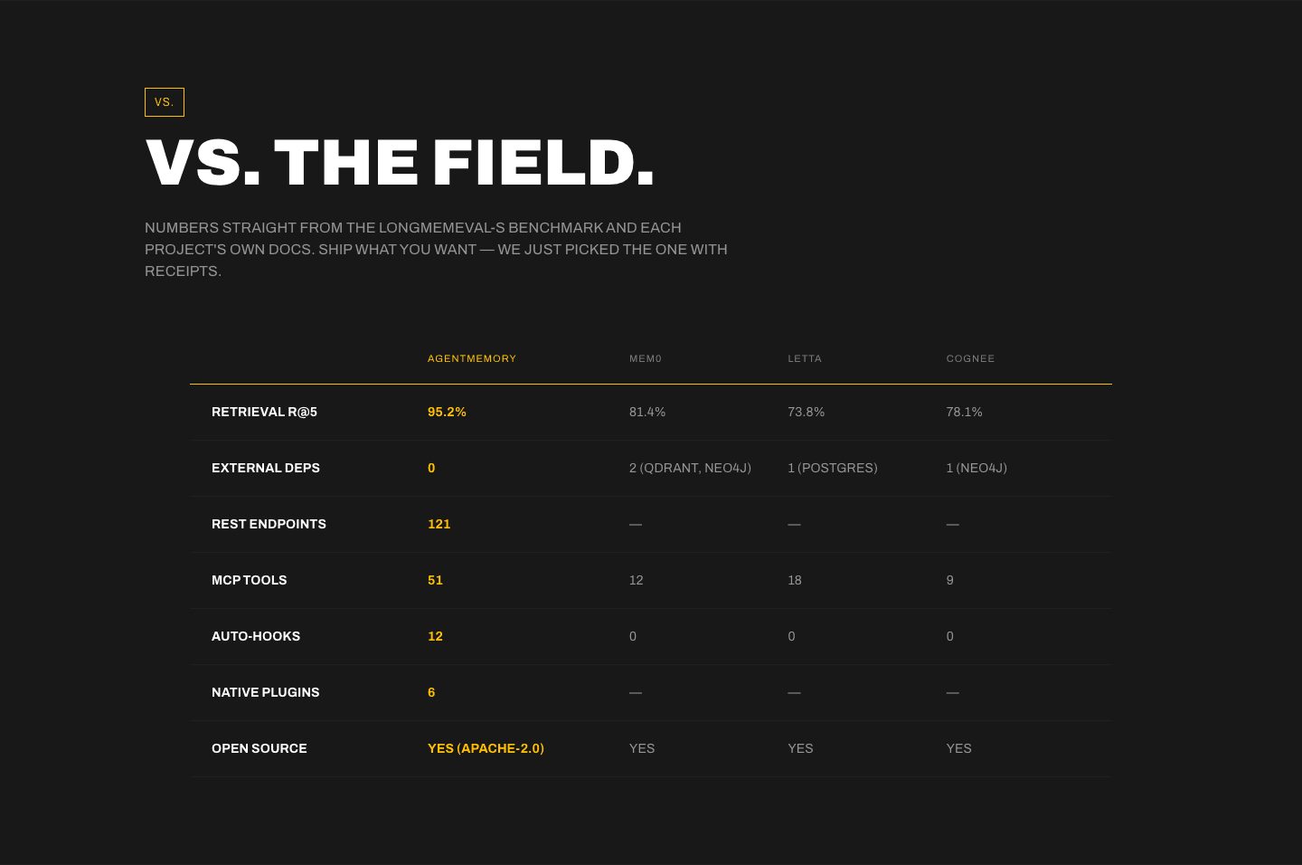
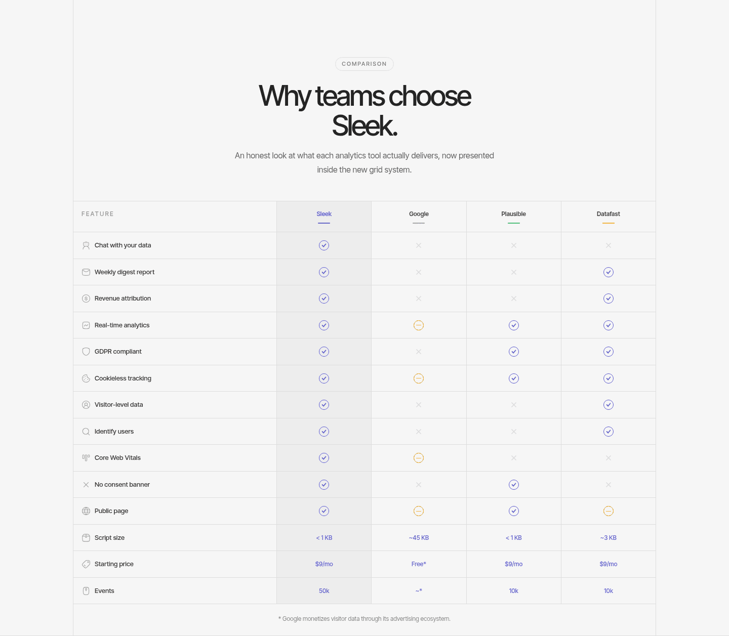
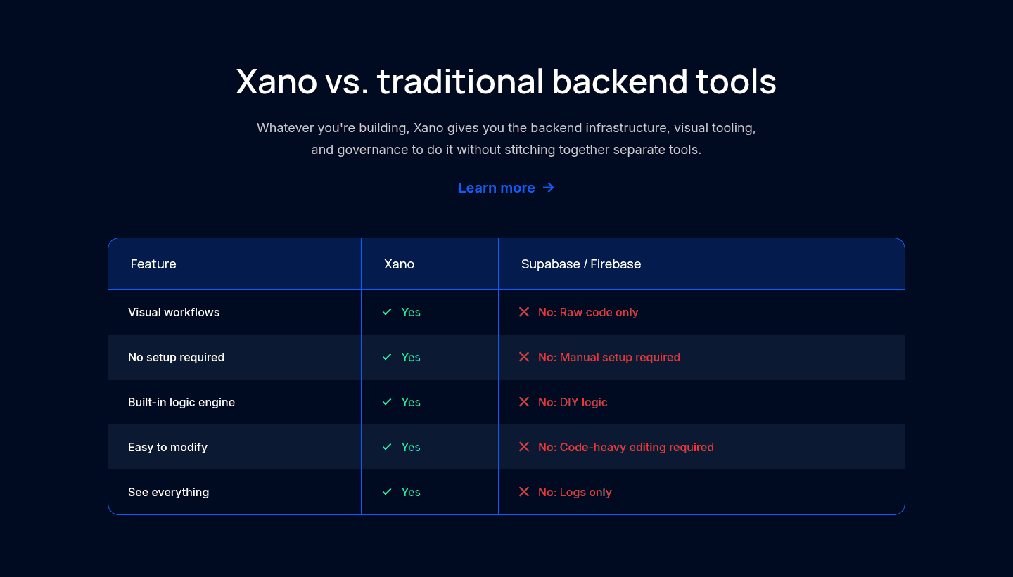
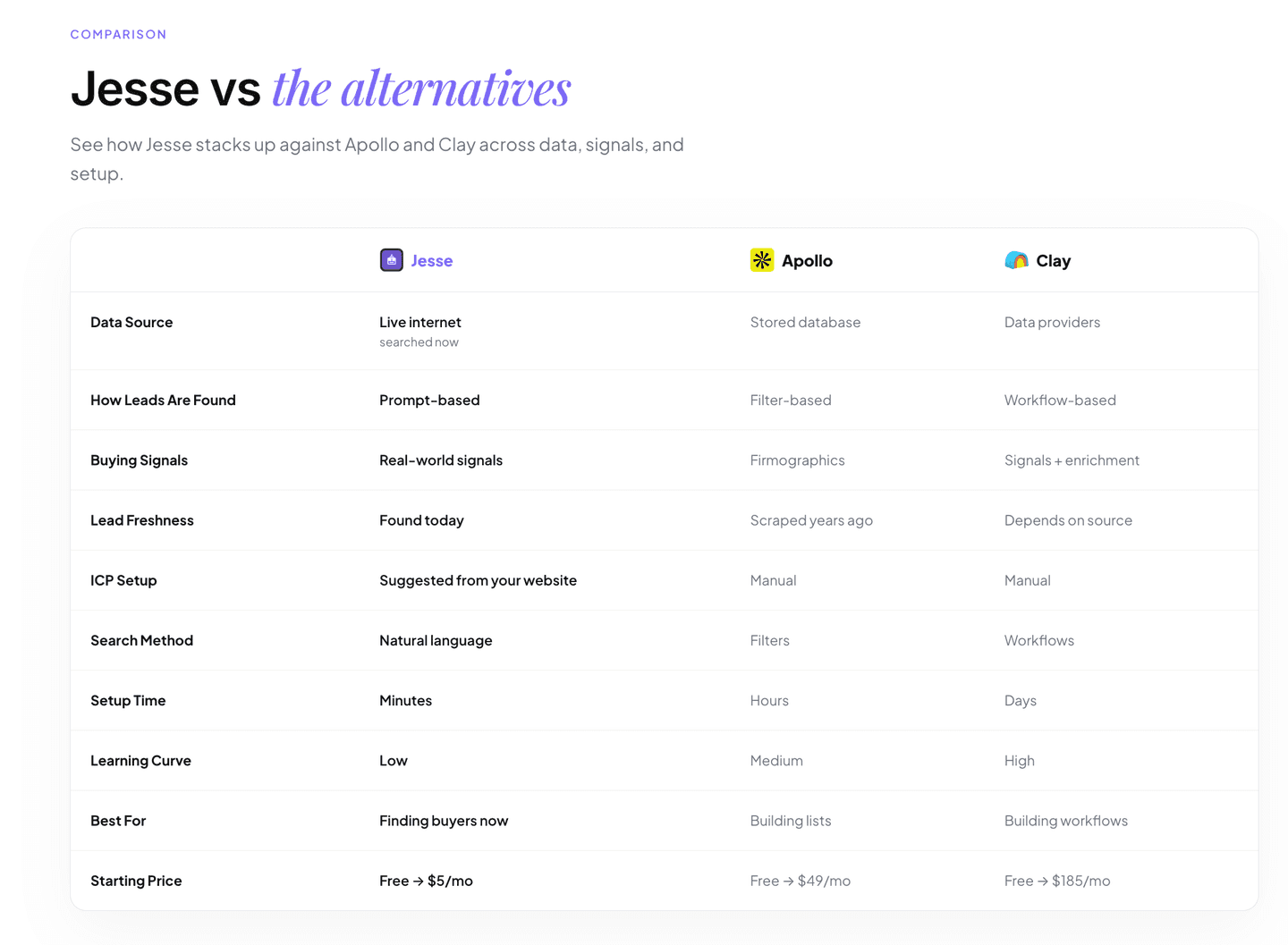
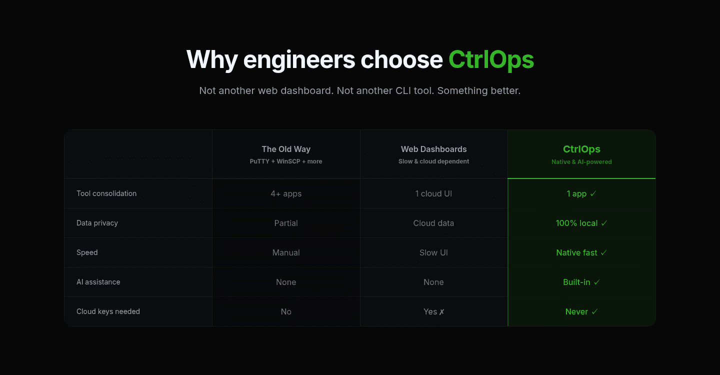
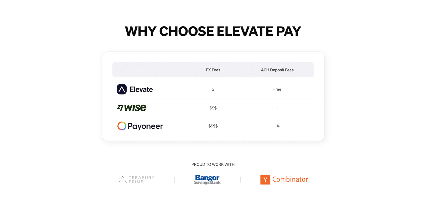
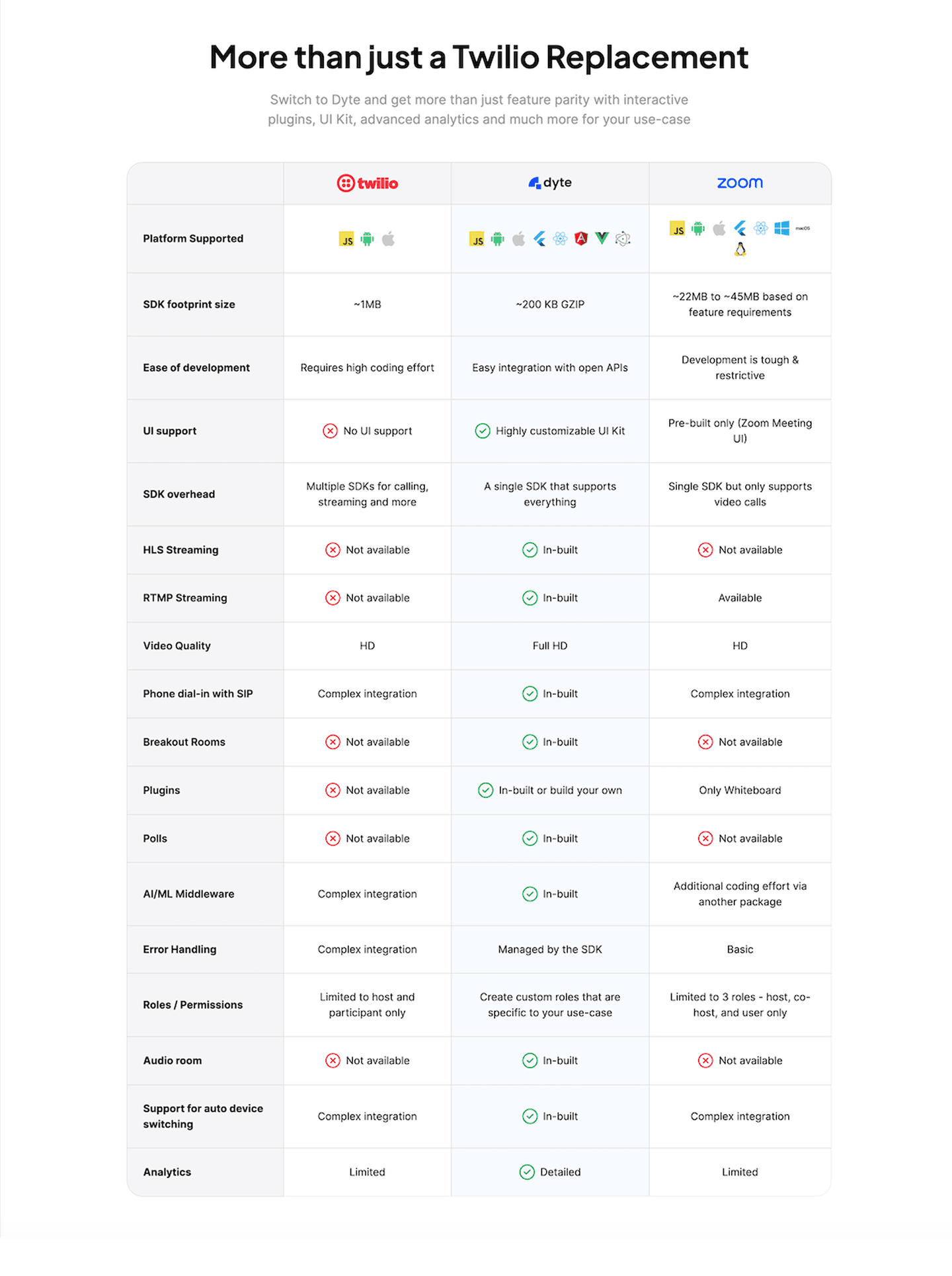
Every comparison section is scored across 5 conversion best practices. Copy the best practice stack, not the layout. See what converts and why.
Hand-picked from 650+ companies and analyzed by our AI conversion agent. Not a random dump of comparison tables. Every entry earns its spot.
Built a comparison page? Run yours through the same scoring engine. See where you stand on the same best practices, and what to fix first.
A multiple comparison is the decision to line the product up against several named competitors at once, in one table or grid, instead of a single one-on-one page. Each column is a real rival, each row is a feature, a price, or an outcome, and the visitor reads the whole shortlist in a single place. The point is not to attack the field. It is to do, on the product's own page, the research the visitor was about to do across five other tabs.
The strongest versions lean on a few concrete levers:
Most buyers do not arrive weighing one alternative. They arrive with a shortlist, and the decision is a matter of sorting that field. A single head-to-head only answers the visitor who happened to be comparing that exact rival. A table that names three to six competitors at once meets the whole shortlist and settles it in one place, which is why nearly every comparison section in our library stacks the product against more than one alternative.
The believability comes from specifics. A green check against a competitor's red cross is easy to wave away as marketing. A concrete cell, a price, a limit, a measured result, is not, especially when a dated source line invites the visitor to check it. Admitting a competitor's real strength costs one row and buys trust for every other row on the table.
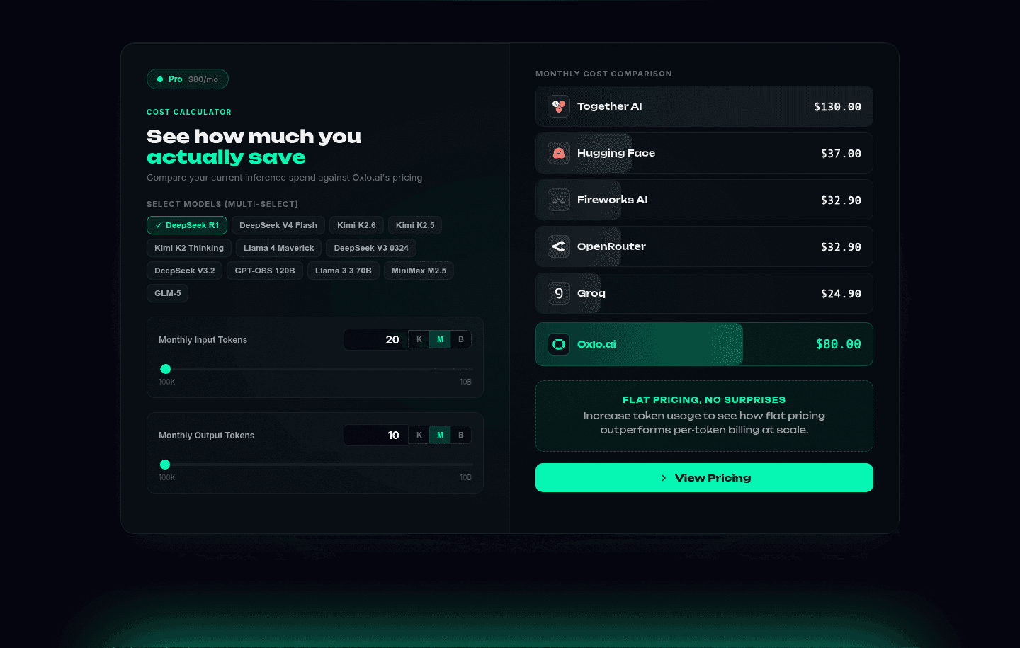
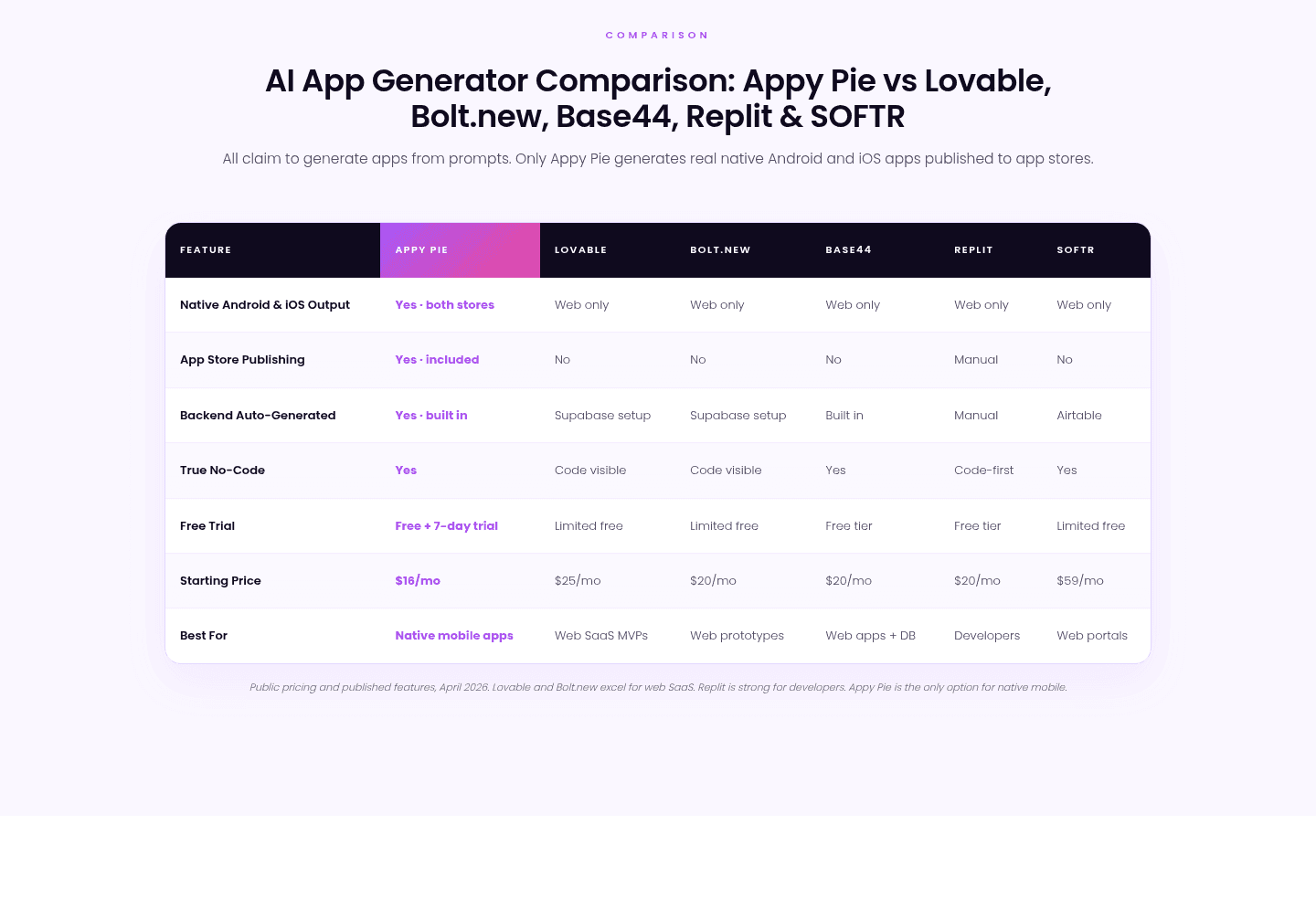
Across the examples below, the pattern that holds up is discipline, not aggression. The best tables name their rivals and fill the cells with hard values instead of vague ticks. Oxlo.ai runs an interactive cost calculator against six named rivals with live monthly-dollar figures, and it openly notes it is not the cheapest at low volume before making its flat-pricing case at scale. Appy Pie sets its column against five named builders on concrete feature rows, stamps the table with a dated source line so the claims are verifiable, and still admits in a footnote that two rivals excel for web apps. Both earn the win by being checkable, not loud.
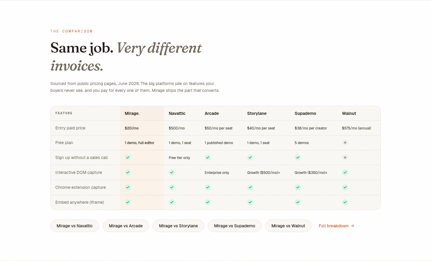
Restraint on row count matters as much as the columns. Mirage keeps its matrix to six decision rows so the comparison reads in one glance instead of a thirty-row wall, then places a call to action where a decided visitor lands. The lesson repeats across the gallery: pick the rows that actually change the decision, make every cell concrete, and let a source line carry the credibility. You can see the full range in the comparison section gallery, and how price framing does similar work in the pricing section examples.
100/100 0/100
0/100The usual failure is a rigged-looking table: the product's column glowing green while every rival collects a wall of red crosses, with no numbers and no source. A visitor reads that as marketing and discounts all of it. The second failure is a vague "other tools" column instead of named competitors, which quietly tells the buyer the claims cannot be checked. The third is bloat, a thirty-row matrix that buries the handful of rows a buyer actually decides on. Name real rivals, put hard values and a dated source in the cells, admit where a competitor genuinely wins, and stop the table at the rows that change the choice.

Curated by
Gabriel Amzallag , Founder, Web Anatomy
5 years CRO + SEO at Qonto (2021–2025). After advising 15+ SaaS on their websites (Payfit, Pigment…), the same patterns kept breaking, so I decided to build the source of truth on what works on the web: the intelligence layer every tool, builder, and team uses to ship sites that perform.
Paste your URL. Get a scored analysis of your comparison section, including whether it names real rivals and backs its claims. Free, no signup.
The common questions about stacking the product against several competitors at once, with answers drawn from 18 real examples.
It is a section on a landing page that lines the product up against several named competitors at once, usually as a multi-column table or grid, rather than a single head-to-head. Each row is a feature, a price, or an outcome, and every rival gets its own column, so a visitor can read the whole shortlist in one place instead of tab-hopping across competitor sites.
Most buyers arrive with a shortlist, not a single alternative in mind. A one-on-one comparison only answers the visitor who was already weighing that exact rival. Stacking three to six named competitors in one table meets the whole shortlist at once, frames the product as the obvious pick across the field, and saves the visitor the research they were about to do elsewhere.
Enough to cover the real shortlist without turning the table into a wall. Three to six named rivals is the common range. The bigger risk is row count, not column count: a table that stops at the handful of rows a buyer actually decides on reads in one glance, while a thirty-row matrix gets skipped. Pick the columns that match what buyers cross-shop and the rows that change the decision.
Concrete cells and a verifiable source. Hard values like a price, a limit, or a real number are harder to dismiss than a green check, and a dated source line ('public pricing pages, June 2026') lets a skeptic check the claims independently. The most trusted tables go one step further and admit where a competitor is genuinely stronger, which makes every other row read as fact rather than spin.
After the product has made its case, once a visitor is comparing options rather than still learning what the product does. Placing a call to action directly below the table catches the decision-ready visitor at the moment the comparison has done its work, so they act without hunting for the next step.